 |
October 26, 2018
Aaaaaaaaaaaaaaaaaaaaaaaaaaaaaaaaaaaack! Yes, that's me screaming. I had this all set to have you all preview this brand new Color Primer. I've been working really hard to get this out before Christmas, and my site has crashed!!!! Mercury must be racing in retrograde as the tech gremlins have been working overtime.
So for today's weekly goodie, I'm sending out the same email, but instead of offering the whole document, I can only offer a preview. If you go over to the site you'll get some gobbledegook about line 28 be all askew!!! I have the tech folks working on it, but my guess is that it will take a while to cure. In the meantime, I'm including the original download as a preview for free.
Read on and wish me luck with the binary gremlins!
I love color.
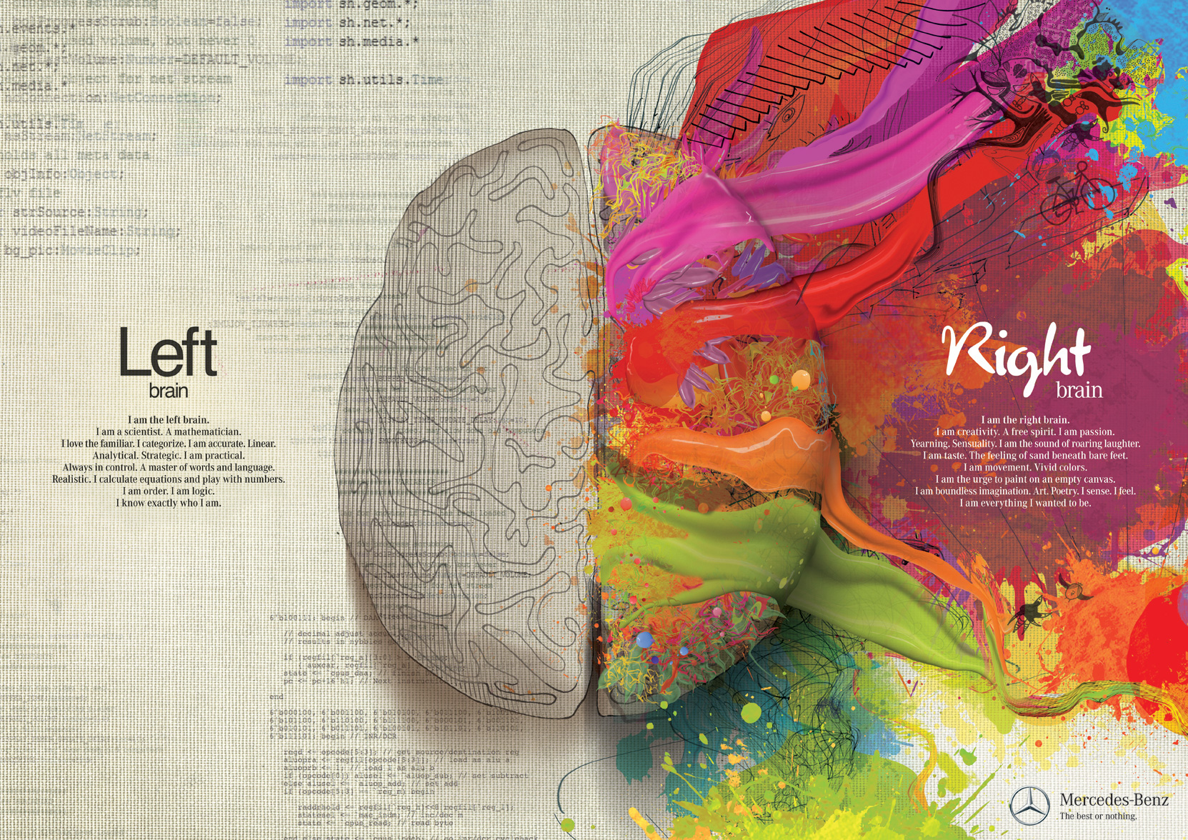
As a matter fact, this graphic above is so memorizing, I can't even see the left side. And when I'm painting I have to use a color diffuse so that I can finally see the values (that's the lights and darks).
I mean who wouldn't like this map?

I can get side tracked with graphics like this and get all mesmerized by color.
But color can be more than memorizing.
It can be camouflage.
It can be complementary.
It can be complicated.
It can be confusing. I
t can be crucial.
I remember when I learned to make a tailored suit, I was so excited. I also had my teacher make me a fitted pants pattern and I was so excited. So much so I made a pants suit in every color...yellow (and I mean bright yellow), bright orange, red, bright clear blue (not navy), violet, and green. They were gorgeous, but somehow I hardly ever wore the blue and violet. They were gorgeous in my closet and made me think I had filled that part of my wardrobe -
after all I had to have every color in my wardrobe - right?! Uh- no!
Colors count and they matter.
A lot of my weekly missals here start with what's been going on with my life. I've just finished a gorgeous wedding gown and dress alteration for the MOG (mother of groom) - the wedding gown was for the bride (duh!). And the mother brought me an Elie Saab to remodel for her. She loved the dress and it was beautiful, but my heart sunk when I saw
it. The truth is that it was not her color. I had to make a lot of alterations to it, but finally we had to replace the inside slip - the outside was a heavily beaded, and I had the chance to make the color right. I sampled many fabric and put them all under the beaded layer and she instantly saw the one that was great for her. When we finished the dress was stunning on her and made her feel fabulous. Yes, the Elie Saab was gorgeous, but we made it even better when
it was closer to her color range. In the end she kept saying how beautiful the dress was. I'm not convinced she understood that color made that much difference, but she did see something was right and was happy with it, so we left it there.
This happens a lot with my clients, that they pick out the dress that they think is their dreams only it's the wrong color. Buying color for one self isn't hard, but it's something we really don't think of. We think if our eyes are blue, then blue is a good color for us. If our eyes are green then green is a good color for us.
Here's how that philosophy works.
 
Nicole Kidman has blue eyes and looks awful in blue, but fabulous in green.
 
This one really isn't difficult at all, it's a slam dunk that even though Angelina Jolie has green eyes, she looks smashing in blue.
This makes the point that some of the rules you've heard about what color looks good on you and what color doesn't aren't right, and particularly when you hear things like, "Well, if you don't have blue in your wardrobe you should!" Uh.....no! Because you do NOT have a color in your wardrobe there's probably a reason why - and that reason is that it doesn't look good on you.
But colors don't need to be that difficult. It simply takes a little time to acquaint yourself with the tools of how to use colors. Like anything else, especially if you are coming to the idea of colors from a novice point of view, this takes good classic methods and practice. Like sewing, it gets better with time.
The main reason colors are so important to us, is that we all fall into a basic group of colors - lights/brights, deeper/darks, warm and cool. Within these groups we can find a set of colors that are remarkable on us, and if you think they aren't check this out:
 
So there are colors that are good for us some some that aren't.
There are colors that can mask and colors that can attract attention.
There are colors that make us look important.
There are colors that make us look approachable.
There are colors to make us feel better about ourselves.
There are colors that really make us look yucky (that's a technical term!)
After dealing with color for almost 4 decades, I've figured out the best way to explain and educate about color and put all those in a concise but very informative e-book about color. It's packed with downloads and simple explanations on color palettes as well as online helpers to help you put together colors that will work for you.
There's one more plus to this that no one suspects or warns you about.....that staying within your palette of complimentary colors means that when you purchase inside that palette, most everything goes together.
For more on this, I wrote down all that I've learned in teaching and working with my clients. And you can get it here and try it out cause it's at a 50% discount till November 1 at 11:59pm. Use the code OCTOBER2018 .
OK - well that didn't work because the site is all askew - so instead, here's a link to the preview of the whole e-book - let me know what you think. This is only a small part of the e-book, but at least it will give you and idea of what it's about, and as soon as the tech fairies finish their magic, then I'll have it at a serious discount for you all!
Color is such an important part of how we flatter ourselves, you will really love knowing how much it affects your looks and the outcome of your garment. After fit and style, color is next in choosing the right fabric for your garment. And remember you get to keep this document forever (well, that is when the site is back up!)
Sometimes the Emmys sneak up on me cause they are not in the traditional Red Carpet Season (which is between Jan 1st & the Oscars – usually the first of March or end of February). But we had them last night and where there’s a red carpet, there’s […]
Read more →
Again, there is NOTHING more fun for me than taking an older dress and making it all new again. Emily was a client who came to me with her old deb dress and wanted to create something new for her. Her new dress is a lot more […]
Read more →
Each wedding brings its own set of puzzles to be solved. That is what is so much fun about what I’ve done. OK, I’ve solved this puzzle and that one, give me another – love a new puzzle. Kathleen was a whole lot of fun and she […]
Read more →

PS - I do a lot of posting on Facebook as both Claire Kennedy and SewingArtistry - if you want to friend me to check out the goodies over there for free!
To view this email in browser or to see past emails click here.
|
|
Follow Us!
    
|
|


