 |
March 28, 2021
Last week in all my excitement about my new toy and finding the new conversion chart on the free Pantone app,(PC, Android and iOS), I was remiss in not talking more about the element of color in the
selection of parts that make up a good design.
Line, shape, style, size are all great and important components to making up a good design, but color is one of those of those elements that seems so basic that it supersedes the others. This is in part due to the fact that we are acquainted with color at such an early age, that it seems normal and entirely acceptable to be a vital part or element of design.
 Being that vital part, means that it's vital to understand it. Understanding it allows us to use it better. This diagram has always been the best description of the components of color - hue, (color like red, blue, yellow), chroma (amount of hue - deep or light), and value (the amount of hue, deep
to dark). Applying words to color theory, make-up and description is really difficult cause color is such a personal thing, but also we're talking about something exceeding real, but exceedingly abstract. In truth, we can't even touch color because color is actually light - the light reflected from an object. Being that vital part, means that it's vital to understand it. Understanding it allows us to use it better. This diagram has always been the best description of the components of color - hue, (color like red, blue, yellow), chroma (amount of hue - deep or light), and value (the amount of hue, deep
to dark). Applying words to color theory, make-up and description is really difficult cause color is such a personal thing, but also we're talking about something exceeding real, but exceedingly abstract. In truth, we can't even touch color because color is actually light - the light reflected from an object.
Not to make this too difficult, but this explains part of the dilemma in working with color. We all have our idea about what color red is, but the truth is that might be tomato red to one person and cerise to another and ruby red to yet another. Those are really three different reds, and they all have a function, and believe it or not they are all correct for one type of complexion, and horrible on another.
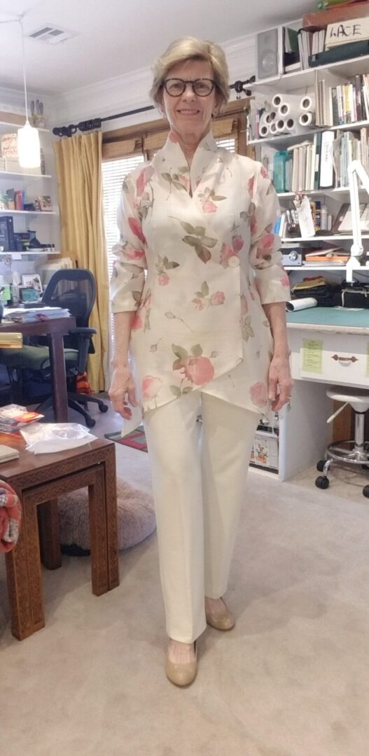
When I first learned this it was at the expense of making three different suits for myself. I went through the tailoring, fitting, shaping, and styling of all three suits only to find out that none of them worked. I immediately thought it was my styling or shaping or something, but the plain fact was that the "wow" factor wasn't in the suit. For some reason, I decided to try a cream fabric and there it was - the "wow" factor.
In selecting the color, this can often make the difference between just and "okay" garment to a "wow" garment. If you select the wrong color, you may end up with an "okay" garment and not know why. It doesn't matter if your execution is excellent, your fit fabulous and your styling right on point. If the color is off, it will through the whole garment off. That's why it's key to know about color.
And here's the mysterious thing. It's often hard to see. When warm-complexions where "off" colors, they usually glare out like some warning lights on an ambulance. When cool-complexions wear the "off" colors, they look greyed out and dead. That's why it's hard for some of us, and obvious to others.
So how do we tell? What's the clear signal? The first way is to understand that there are certain palettes of colors that look great on some complexions and other palettes on other complexions. Here are some great examples:

Olivia has a terrific warm complexion and the orange looks fabulous on her, but the purple takes the color all out of her checks. It's a great example of how color can work to enhance your coloring.

Jessica's coloring is really more dramatic here. From the blue dress (which I'm sure she was told would "bring out" her blue eyes, can't tell you how many times I heard that one), to the turquoise dress, one flatters and one doesn't.
The differences here for Olivia and Jessica is really remarkable and not that hard to see.

This one is a little harder, but not too much harder. This is a clear case of the wrong coloring making Anne look dead or at the least less too stark for her delicate coloring.

This is probably the most difficult to see, except what you notice is that something's not quite right, and then it is, and then it isn't.
That "not quite right" is not something to throw away thinking that it's something you can't see. It's the color. When Viola's blue skin tones are next to the blue-white of the color, it works wonders, but that gold-tone doesn't do a thing for her.
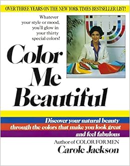
When I first noticed this, about the difference between my white and cream suit, it was clear I needed some help. I could tell that cream was my color, but what about blues, purples and reds? How was I to tell which was good for me and which weren't. I needed help. I used Color Me Beautiful as
my guide. There are many books like this out there, but this was the first one and I found it simple and informative.
Looking at the Pantone Red palette can really give you a quick headache. It's obvious that some of these reds have more blue and some have more yellow, but where's the dividing line?

If you know a blue side is better, how do you choose?...or a green blue for that matter?

Obviously some of these colors are excellent on one complexion and not so cool on another.
Here's what this comes down to is knowing about the "hue" of a color as well as the value and chroma. Believe it or not, some complexions looks splendid in all colors as long as they have very little chroma to them. While other complexions must adhere to a certain set of colors.
We know a lot more about this type of thing than we suspect. We've all had that "wow" dress or garment, or have been told that we look exceptional in a garment and yet not so exceptional in another - although folks don't normally comment on the later, but will on the former. Take note, cause this a place to start - you're own intuition and comments from your friends and family.
Yes, this is unbelievably abstract, and that very reason makes it look a lot harder than it is. But you know enough to "feel" what's right and go with that. From there, a great source like the Color Me Beautiful book can really help.
While I'm keen to introduce you sewing techniques that will help you execute your garment the best, and while I'm keen on shaping and styling a garment to be comfortable and flattering, color can play a huge role in that.
It can make the difference between a "wow" and a "just okay" garment. And we all want that "wow" look!
 Welcome to the world of a great fitting, flattering and comfortable pant. Yes, it's possible and no it doesn't take a Ph.D. from FIT!!!! Once you have this pattern perfected, making pants up is a cinch. It takes an afternoon for a newbie, but for a pro, a couple of hours -- once you have that pattern perfected.
This is the pant that I wear that gets the most compliments and even pros in the business remark at how well it fits because the hang and drape is so good. What they don't know that I do, is that this pant has the "Aaaaahhhh" factor. When I sit down I'm never worried about whether the pant will split or I'm going to have my eyeballs pop out cause the pants are so tight!
And that's what this resource does. Included in the resource are:
- Instructions on the kind of fabric to use and why
- Instruction on the pattern to use and why
- Instruction on fit, hang, the drape of the pant
- Instruction on hems and hem styles
- and when to use what style where
- Instruction on finishing techniques
- Instruction on variations of this ponte pant
- Instruction on styling for different figure types
- Instructions for care
This is full of inspiration, and instruction and is one of my most popular classes at Bernina when I teach in person - hopefully we will do that again!!!
In the meantime here's a fun class at the usually special discount for new resource introduction.
On the Blog
|
|
|
Good fashion can take me away for hours even before I realize what's happened. A simple search, or worse a ...
|
|
|
From the first time I stepped into the Victoria and Albert Museum in London, I was a goner. The place ...
|
|
|
|
A subscriber to my weekly email asked (WHAT?...you don't subscribe? ...goodness, it's free and lots of info over there - ...
|
To view this email in browser or to see past emails click here. (This still works, and will work)
We respect your email privacy
|
|
|
|


