 |
May 21, 2021
OMG, I was flabbergasted when I went to my local Pantone Color chart converter and was about to convert something I'd seen online from that expensive Pantone TPX chart (costs about $250 to $350) could be converted to the cheaper ($70 to $120) charts, and then suddenly like the most horrible thing...this shows up on that link!

What's a person to do? Rely on computer monitors representing the right color? Or relying on someone to describe the right color like "brick red" or even simply "red"? Really? Red is about 50 gazillion colors to 50 gazillion people. That's about as descriptive as saying that plants are green...which plants?...what's the light? ...what's the season? You can't depend upon a monitor or even the light captured from a
camera whether digital or film. You certainly can't depend upon someone else's description of color.
Man, that I was bummed wasn't an understatement. What was I ever going to do about this. I let it go and was working on another color project. Do a hex layout on fabric for my pal at the local fabric store for his print machine. He really needs to have a color chart printed on the fabric so patrons can see what they will be getting. He was showing me a cool little color tool he's using to capture color. It's great but it doesn't help
match a color I want or that a customer wants.
So I come home and start hunting around for this cool little tool, and it's nice, but then I run across one that is integrated with Pantone. Believe it or not Pantone is the drop dead authority on color. They really do know color and know how to describe it and are simply, well, the authority on color. So I'm thinking OK this is the little color capture tool I need. The Pantone part is a subscription, but I'm looking at this as a tool that you all can
use. And it's fun, but not really what I would call useful for the home sewists. If you're in business it's great, but it's a little too expensive or so I'm thinking. More about that later.
But I'm still looking for a way to convert from one Pantone color chart to another. What I'm looking for is an inexpensive or at least cost-effective way for folks in the hinterlands to compare a picture on a computer screen to a real live picture of color that they see with their bare naked eyes! That's the only way to tell color from one from another.
Well, I found it! I'm so stoked about this that I made a video. It's just for you subscribers here - no one else. But to me this is a game changer. This does mean that you have to get that Formula Guide - Coated and Uncoated, cause that's what will tell you what color you're looking at. Here's a list of guides,
but the cheaper the price, the older the guide and the fewer colors that are in it. When you get the higher-priced guide, it lasts longer, and is more useful for you and yada, yada, yada. I'll leave it up to you which one you want to get.
And here's the video. This is only for you subscribers!
Now on that color detector.
 It's a Color Muse (click here for more info) and I love it. I don't mind the subscription to the Pantone chart cause I use that a lot. It also translates the color
into CMYK (Cyan, Magenta, Yellow and K stands for Black which as you will notice are the color in your color printer), Hex colors (colors that are digital, on the computer monitor), RGB, (another set of digitial color codes) and HSB (Hue Saturation Brightness which has never worked for me, but there are digital folks who swear by it). With that varied amount of palettes to identify colors, it makes it really easy to pick a color. It's a Color Muse (click here for more info) and I love it. I don't mind the subscription to the Pantone chart cause I use that a lot. It also translates the color
into CMYK (Cyan, Magenta, Yellow and K stands for Black which as you will notice are the color in your color printer), Hex colors (colors that are digital, on the computer monitor), RGB, (another set of digitial color codes) and HSB (Hue Saturation Brightness which has never worked for me, but there are digital folks who swear by it). With that varied amount of palettes to identify colors, it makes it really easy to pick a color.
The color chart I'm making for the evil guy with that evil printing machine at the fabric store (damn his eyes), is all hex colors. These are the ones most easily translated into digital graphics. With this chart, folks can easily translate the color they see on the fabric marked as a hex, into the color that they want. They can immediately tell the difference between light olive green and dulled celadon, or between Robin's egg blue, and light sky blue!
I have to tell you I love this little Color Muse and what all it can do. It doesn't do what the Pantone Chart does, as it doesn't represent color well. It is a color detector, and in a pinch when you are talking with a fabric store you can place the Color Muse on your fabric and say with confidence, my fabric tests out at hex #C35964 or RGB, 195, 89, 100. From that I can correct my color on my digital graphic and make it work really well.
You have to purchase a Pantone subscription to have the Color Muse translate to Pantone colors. For me that's not that much of an expense - about $89/year. But for you that might be a little steep. No matter, because with the help of the Pantone Color Converter, you can easily translate from one Pantone palette to another as well as from scan by the Color Muse to hex to the Pantone converter for a Pantone color.
Here's the big problem with the Color Muse. It can not make a sample of the color that you can see by the light in the room reflecting from the color sample. The sample that you see has been generated by light from your smartphone. Those are two completely different animals, and it doesn't give you a good read on the color. You will need a color chart from Pantone to do this.
For me the Color Muse is great, but it might not be the end all for you.
The Pantone Chart converter IS THE END ALL!!! And I highly recommend a one-time purchase of the inexpensive Pantone chart so that you too can get a good read of what's on the screen.
Emma One Sock, Mood Fabrics and Gorgeous Fabrics are the main users of Pantone color coding, but others are going to use this system in the future. This is the way to translate color from an online photo to your eyes with real consistency and quality.
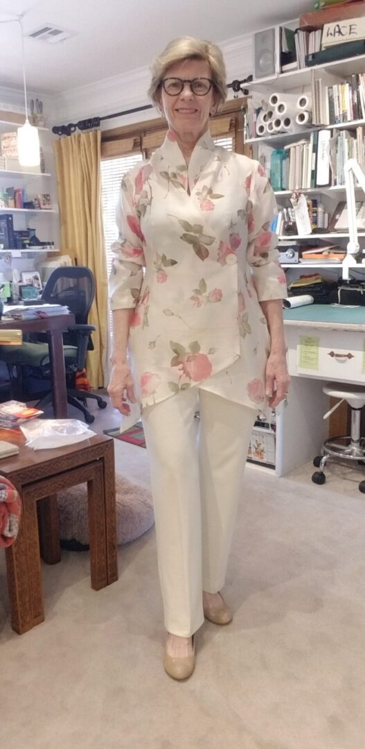
 Welcome to the world of a great fitting, flattering and comfortable pant. Yes, it's possible and no it doesn't take a Ph.D. from FIT!!!! Once you have this pattern perfected, making pants up is a cinch. It takes an afternoon for a newbie, but for a pro, a couple of hours -- once you have that pattern perfected.
This is the pant that I wear that gets the most compliments and even pros in the business remark at how well it fits because the hang and drape is so good. What they don't know that I do, is that this pant has the "Aaaaahhhh" factor. When I sit down I'm never worried about whether the pant will split or I'm going to have my eyeballs pop out cause the pants are so tight!
And that's what this resource does. Included in the resource are:
- Instructions on the kind of fabric to use and why
- Instruction on the pattern to use and why
- Instruction on fit, hang, the drape of the pant
- Instruction on hems and hem styles
- and when to use what style where
- Instruction on finishing techniques
- Instruction on variations of this ponte pant
- Instruction on styling for different figure types
- Instructions for care
This is full of inspiration, and instruction and is one of my most popular classes at Bernina when I teach in person - hopefully we will do that again!!!
In the meantime here's a fun class at the usually special discount for new resource introduction.
On the Blog
|
|
|
Good fashion can take me away for hours even before I realize what's happened. A simple search, or worse a ...
|
|
|
From the first time I stepped into the Victoria and Albert Museum in London, I was a goner. The place ...
|
|
|
|
A subscriber to my weekly email asked (WHAT?...you don't subscribe? ...goodness, it's free and lots of info over there - ...
|
PS - I do a lot of posting on Facebook as SewingArtistry - like my page to see more goodies!
To view this email in browser or to see past emails click here. (This still works, and will work)
We respect your email privacy
|
|
|
|


