ProportionsMay 22, 2026 Probably, nothing strikes more confusion in the hearts of sewists and designers than proportions. What are they? How can I tell if I have it right or wrong? How to fix it when it's
wrong? Those are all typical questions and worthwhile. Because when you get your proportions right, your garment sings (in 4-part harmony...at the same time! 😁 But these aren't insurmountable problems, and for the most part, we know a lot more than we think we do. When we stand in front of the mirror, we can tell when something is right (and we tend to pick it to wear over and over again). But when something's wrong, even though we know it's wrong, we may not be aware of what it is. Part of the problem is that the proportions or balance is one of the principles or instructions on how to arrange the elements
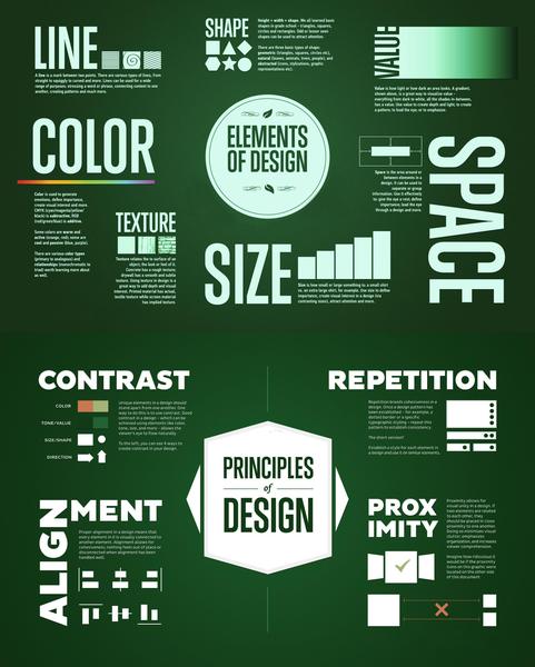
(line, color, shape, value, space, size, and texture) of design. So proportions could pertain to the line of the design (hemlines are out of balance), color (one color out of balance with another), values (lights and darks are out of proportion), space (or lack of space is not in balance), size (of different elements are not in proportion to each other), and textures aren't in balance. Let me assure that, even for professionals, this is a lot to take in in one look. That's why
having at least a chart of these ideas around is helpful.
So let's talk a little about this. Do you immediately think of the line when you look at a design? How about Space? Then there's texture, size, and value? You might think a little about shape in a silhouette sort of way, but in parts of
the design, would you think about shape? I don't, and I know what these are. The point is that if you don't have that list right in front of you, you don't think about them. That's why having this little chart of elements and principles is so handy. This chart represents a ton of permutations in a very concise and clear manner. Here are some of those questions:
- Are the colors in balance?...do have have too much of one and not enough of another?...are the complementary?...or monochromatic? Do they align well, and are balanced well? Is one too reptitious, while another is not? Are the colors in a good proximity to each other?
- Size and Shape - are they in alignment, in proper contrast?...do they repeat in a pleasing way?...are they in balance and
good proximity with each other?
Holy cow - you can begin to see the huge number of questions that this brings up.
Now most of these will not have an answer - if it's a black and white dress, you don't need to worry about color - if it's a solid color you don't need to worry about prosimity, but you do need to worry if the top is in balance with the bottom - IOW, if the bottom is extra heavy, something will be askew, and it's the balance of the top to the bottom. The point is that this chart raises these questions, and with them come answers you might not even have thought to ask. This makes your proportional questions much more specific and therefore more answerable, so that you can begin to effect a solution. After all, if you
can't find the problem or don't even know there's a problem, you can not even hope to have a solution.
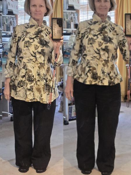
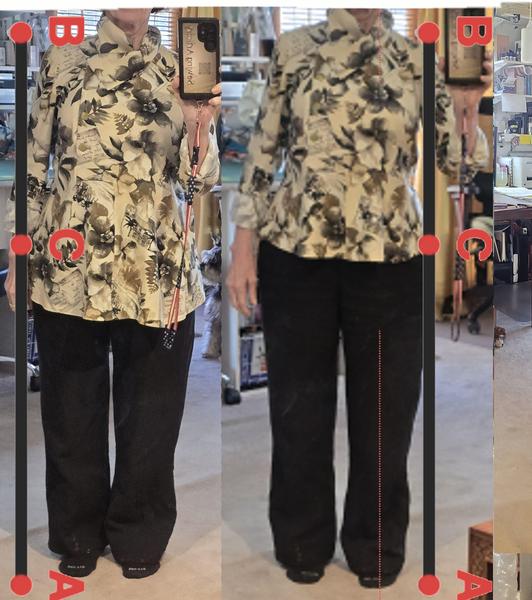
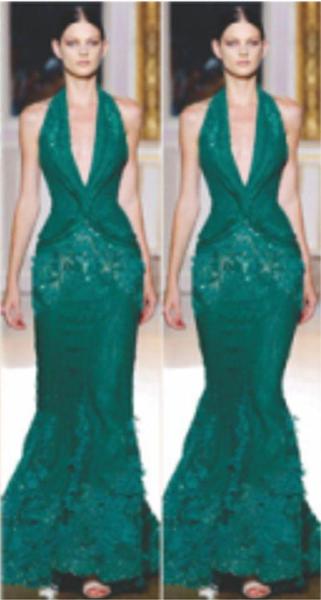
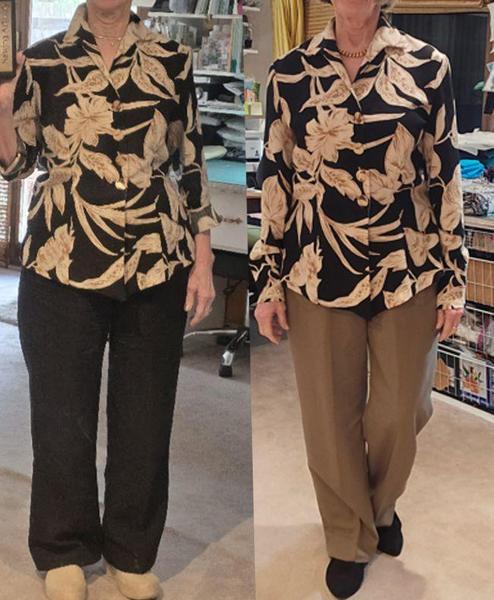
Here we have two examples. I knew before I put on this top on the left, that it was going to be bad, but I didn't know how bad, till I had it on. Whew! Thank heavens I fixed this.
Here's my thought on this (and this was before I
even put the top and pants on), the top on the left was made to go with leggings, which would be very tight. Therefore, the top had to be a little lower so it wouldn't overpower the pants. Also, to give a little nod to my legs. My legs from my mid-thigh down aren't bad - well, sagging knees, but in silhouette, they aren't bad, and an area that I can show off.
But as I've gotten older, I think leggings are really for a more youthful figure, and I need to be a
little more age-appropriate. This is a personal decision for all of us, and the choice to look this way or that is what matters to us. I'm probably in the next-to-last decade of my life, and toward the end of that decade, so that's no spring chicken, and I need to be more reserved about my presence. There are women older than me who still like to dress - Yvonne LeFleur on Instagram dresses the same as she always has, but she's dressed up a little. I don't see her as a torn-jeans, ill-fitting top kind of gal!
So I'm thinking about wearing pants more than leggings, and making it look classic, tailored and timeless. That way I won't have to change again. But here I am in this top which I adore - it makes me feel wonderful, but not in these pants - so I need to change it but how?
This little tool, called the "Golden Ratio," is found in everything on the planet and therefore looks right to our eyes. It's a math proportion, so there's no guessing. You can instantly see that the one on the right is much better than the one on the
left. The "C" point is right at where it should be and even though you might think this would not be a good place for a Pear-shape to be, it works because it's in that pleasant proportional area. So this Golden Ratio proportion tool is a good place to start. It's not the end-all, but it will narrow down your possibilities to a small area that you can tweak on your own. For example, when the line for my skirt hits above my knee, I will always lower it to just below my knee simply because that's where I am with my age right now. And that small adjustment is usually OK with the eye; although it may be a
little off, it still registers as OK, and that things are in proportion.
The point is that we have help for some of our problems with proportions. But this can't help everything. Because there are the girth measurements from shoulders, to bust, to waist, to hips, to height that matter. Plus, you have to take into account the different figure needs of Apples, Rectangles, Pears, and Hourglasses to accommodate the different problems that each of those figure types presents.
As far as girth is concerned, I use a different technique, as it helps me maintain
good proportions without having to adjust my client's bust, hip, shoulder, or fanny size.
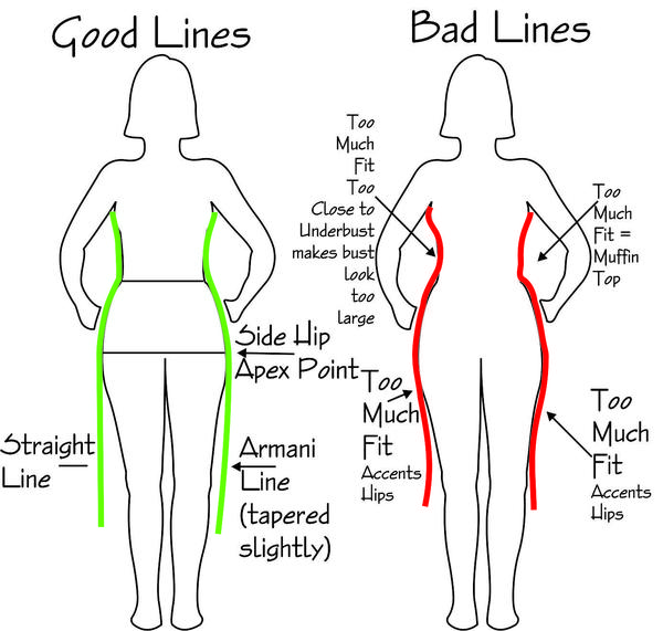
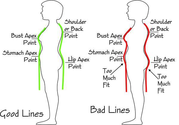
This principle works on the premise that fitting the underside of an apex point accentuates that point, and de-accentuating that underside de-accentuates it.
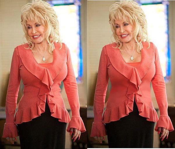
Here's how this works. Which model above has thinner hips? The one on the left looks thinner, although both hips are the same size. Why, because the underside of the silhouette on the right has been accentuated, and therefore makes the hips look
larger. This principle can work for the bust, shoulders, stomach, hips, and fanny.
From the front.
From the side:
In both cases, moderating that line below the apex can be the complete solution to a fitting problem.
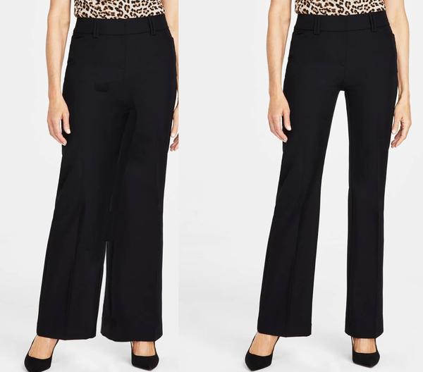
One caveat to this is that today we are so used to seeing a boot cut, that if we don't see one, we immediately think the pants are granny pants.
These are the same pants, just filled in the middle of the body, and wow, they look like they belong on Dowager Countess of Grantham - if she wore pants! The point is that as long as we leave that boot cut, which is a slight curve toward the body from the
mid-thigh to the hem, the pants will be OK.
But again, we have to keep things in proportion, and if you tend toward sloping shoulders or larger hips, you need to have balance between your shoulders and your hips. Your waist can be thick or thin. Although if it's too thin, you can run into
the base of the hourglass, where the body is in proportion, it's just the waist is too thin. Yeah, I know, you think the waist can never be too thin, like your hips can never be too thin. Believe me they can and it can be a proportion alarm zone when it happens.
But let's take the shoulders and hips, because if you have those in balance the rest is a piece of cake. The way to do this is with shoulder pads. Yes, I know this isn't the 80's and I'm not proposing we do a Joan Crawford, a la 1940s or a Joan Collins/Alexa Carrington mockup! This is a very small shoulder pad that is reall there for no other
reason than to make sure there's a little structure to the shoulder.
Here is a perfect example. The version on the right looks perfect, lovely except that the shoulders are really sloping, and not only that, but the right shoulder is a lot lower than the left. I'm already having problems with the hem of my pants.
Notice the black pants where there is a substantial "break" on the left side and a mini "break" on the right side - that's because my left hip is higher and drawing up the pants on that side, while the right hip is lower and the pants hang lower. I've fixed this in more recent make of this pant, and need to fix it in my older pants.
But to the main issue: the shoulders. They are much closer to the face, and, basically, a little eye-wandering from the face to the
shoulder can cause a huge issue. The fix: shoulder pads. Look at the version on the left, and you can see that not only are the shoulders crisp and have a nice, sharp corner, but they are also the same height.
So this brings up two points: one is that we're fixing the shoulders, but we're also faking it so the shoulders look nice and broad and even, even though they aren't even at all. One of the nice things about working to balance your clothing is
that you can make it so it has little tricks of the eye, and your shoulders are not only broad, but they are even, if they aren't.
So with the shoulder pads and the hem, I've fixed this outfit to make it look like my shoulders are even, and my legs are even too - even if they aren't really!
And then we need to balance the other way - if you carry most of your weight above your shoulders, how do you keep that in proportion to your thin hips, or in some cases make the thick waist look like it's a waist, not just straight.
This is where we use
that apex point to give the illusion of a waist.
Here's what's going on (and this applies to waists that are too small). When I expand the waist (on the right), it modifies Dolly's bust, making it look a lot smaller. Why? Because the waist-to-bust ratio is smaller than the waist-to-bust ratio
on the left side. When the ratio is larger, it will exaggerate both the waist and the bust.
This is a trick that you can use for both large busts/shoulders AND for a small waist.
The fix for large shoulders, large busts (or even small busts), and large waists (a Rectangular shape): nip in right under the bust to give the illusion of a little waist, then bring the silhouette straight down to the hips or hem. This gives the illusion of a waist under the bust,
and that's all you need.
For the waist that's disproportionate because it's so small, don't fit on the exact waistline. Fit about 1" or so above the waist nad then drop down to the hip line. Make that silhouette straight from 1" above the waist to the hip line as straight as possible. Because this slope is much gentler than if you fit the waist exactly, it modifies the out-of-proportion size to look normal.
A friend has told me while ago that shoulder pads can make you look like you've lost
10 pounds. And it's entirely true. As we get older and things begin to sink more, shoulder pads can be a huge asset toward keeping our look like our body is defying gravity when it's really not!
Even Apple-shaped and Rectangular-shaped bodies can respond to the smallest of shoulder pads. I've gone back to putting them in all my garments and it makes a huge difference.
There are tons of resources here, and I decided to list them all together so you will know exactly where to find them.
Shoulder pads - I recommend 1/4" to 3/8" pads. I'm using the 3/8" on my lower shoulder and the 1/4" on my higher shoulder. It doesn't take much to even you out.
Here's some great information with tools and a video on how to use this tool, for proportions. It's not that hard, and this gives you a great heads up on where to start to make your proportions work.
If you click the Elements & Principles of Design photo above, it will take you to the download page, but just in case, here it is. It's nice to either print out or have handy so you know the questions to ask and what not to worry about!
I know you may feel like you're drinking through a firehose right now, but this isn't that hard. Honestly, a few questions generated from the Principles and Elements of Design can take you to your
problem, and that's a long way toward solving it. What I love most about the diagram is that it causes me to think differently about my design, not look at myself in the mirror and think I need to lose 5 more pounds, or I need to comb my hair, or I need to put on some makeup, or....well, you get it. It takes me completely out of that and onto the garment. It's the garment's job to look nice, not your job to look nice for the garment.
So let's make that garment work for you now!!!
|
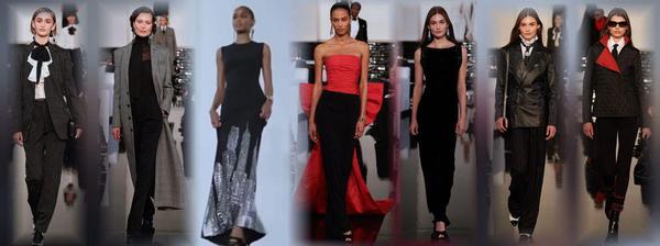
This is a sad day - the loss of a classic tradition. Armani held the line
to fashion style that ...
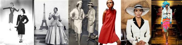
Tracking a fashion trend isn't all that hard after seeing a few of them.
Living from Mid-Century Modern through Twiggy...
It's worth the time to look at these styles, particularly today as
there is a group of that wants to look....
This is the way fashion used to be -- pretty, flattering and I can't wait to make some of...
NOTE: There are some folks who can't get my email, or it's sporadic, or something is hinky. I will always respond to any of you who send a private message, whether it's about the topic of the week or something else. If you don't get anything
from me, it's probably because the [email protected] email is blocked, and even a private message can't get through. In that case, I'm on Instagram often, and you can always PM me at @sewingartistry.
As a precaution,
please ensure I'm in your email Address Book and check your spam, junk, and trash folders. Some email clients get extra excited when they see emails coming into the Inbox that go to many other receivers. They automatically think it's trash or spam, and it never makes it to the Inbox. I must constantly check my spam and junk folders to ensure I'm getting the emails I subscribe to.
To view in browser along with past emails, click here. We respect your email privacy. |
|
|