Color TroubleApril 12, 2024 Oops! I got up this morning with an error message that my email didn't go out. I'm in the process of figuring out why, so sending this out manually. Tech sometimes gets the better
of me!
Many of us know by now that there are certain colors that work well for us and certain ones that don't. We've experienced that gorgeous dress that we may have seen on someone else - a model, movie star, or even a friend and it looks spectacular, and then suddenly, BOOM! It looks like a piece of cr*p junk on us.
There's really a formula for that, and you can pretty much be guaranteed that the right color works for you can be a little
easier with some knowledge.
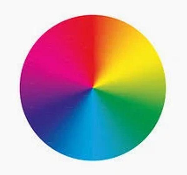
The first thing to understand is the color wheel.
Isn't this pretty? I love color wheels. But back to our color trouble - we need to know the areas that get iffy. Color wheels gradually go from one color to the next. That means there's really no clear demarcation line between green
and aqua and turquoise and blue. And what we're looking for here is warm colors (green, yellow, orange and red) and cool colors (blue, purple, crimson, and red). You can see immediately that there are trouble spots where the warm colors turn into cool colors and where the cool colors turn into warm colors.
Those two zones are red colors and blue/green colors. Because the wheel gradually turns from blue to green and crimson to tomato red, those zones can be tricky.
You might be able to play with them a little - by coordinating them with the right colors. A little cool red, with an orange or yellow, might turn that red into an appropriate color for warm-toned skin, while a little blue with a border-line green would turn the green into a pleasant color for cool-toned skin.
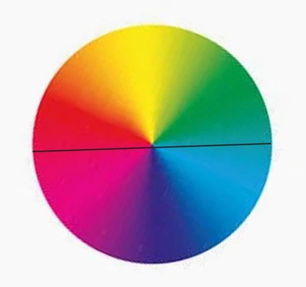
This shows where the tricky spots occur.
Right along this line and either side of it is where the colors can be tricky.
Honestly, I don't care about what happens between the crimson and indigo and purple or between the blue and purple. And I don't care about what goes on between the
red and orange, and yellow and orange, and even the yellow and green. But me being a warm-toned person with a ruddy complexion and with red-toned hair, if I get too far into that turquoise and sky blue, I look like a psychedelic sireen - not a look I'm striving for! Here's where this gets confusing, and this is hard to show on computer, but I'm going to try.
Reba has bright red hair and a very ruddy, warm complexion. She does best with those tones that flatter and compliment her complexion. If you (hopefully ) can see a difference between the two examples above, you can see that one red is slightly
different. Look carefully at Reba's face and see which one you like the best. One looks like she has a little more "blood," sort of like flushed. To me, that's the one that looks better. The one that has a "healthier" look is the one on the right. The reason is that the one on the left has more blue, which clashes with the ruddy complexion. So, if I were dressing Reba, I would choose the example on the right. She just looks prettier wearing clothes on
the warm side of the color wheel. So, within the red color, you have warm reds and cool reds, which become difficult to deal with. What
you can do is play with the color and see what happens when you go from the purple side of red to the orange side of red. I really like this online colorwheel to play with these colors. Watch what happens - here's a pretty good example of what happens as red travels from the orange on the left to the violet on the right. The left three could be
reds, and yet they are all three different colors, from orange-red to tomato red and crimson. Reba's good colors here are the orange-red , tomato red. When one color is good, it doesn't mean another isn't good too. This is really dealing with those "edge" colors that make this more difficult.
This is another example in the other problem area of the color wheel. This is that difficult green and blue transition. This is a little harder than the red transition, because you go from one color to another. It's also difficult because the
coloring between two completely different colors.
From the blue on the left to the yellow on the right makes a completely different color - green, and that transition between blue and yellow goes from Aqua to Green to day-glow Poison Green to gold (or yellow). Those are substantially different
colors. And again messing around with an online color wheel, helps you see this. Here's the closer transition.
The reason it's important to see this closer transition is look at that middle color. It looks like it would be good with a warm complexion as well as a cool one. But the truth is that it's tough on a cool complexion. That jade or turquoise is
great on ruddy folks, and gets almost too strong for cool complexions.
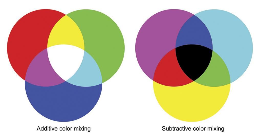
Additive and Subtractive Color Mixing So, there's another thing we have to consider when we're talking about color here. Two different color wheel mixings matter. One is light or additive, and the other is dark or subtractive. That means that when working with color on a computer, we are working with light. If we combine all the colors together, we will get a white - think of the rainbow that refracts the colors from the
white light of the Sun and creates the ROY G BIV colors of the rainbow: Red, Orange, Yellow, Green, Blue, Indigo, and Violet.
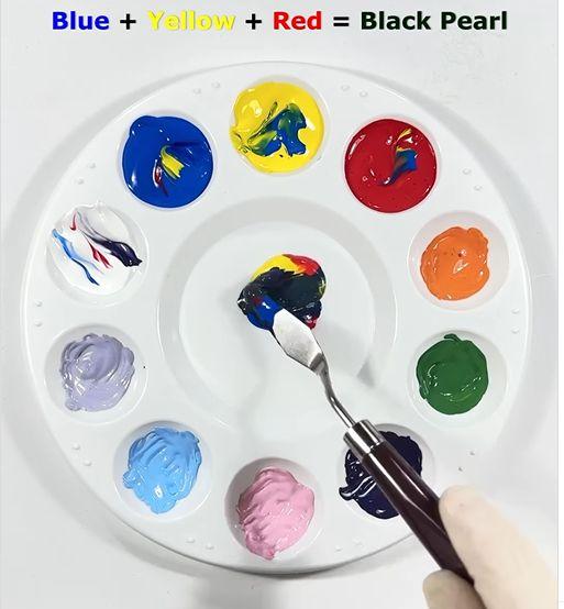
In printing, we use subtractive color mixing. This is similar to what happens when you mix colors from paint tubes. For example, mixing cadmium yellow with cadmium red creates a clear orange, while mixing cadmium red with thalo green creates a muddy color. When you mix all colors together, you get black. These are reflective
colors, meaning they reflect light to show color. This is the subtractive form of color mixing.
So why does this distinction matter? When you print, your printer will have CMYK colors, which means Cyan, Magenta, Yellow, and K for Black to distinguish it from Blue. This is additive color mixing. When you're using subtractive colors like in tubes of paint, you will have the primary colors, Red, Yellow, and Blue, and along with black and white, you can technically mix
those colors to give you all the colors you need to paint with. Alizarin Red differs from Cadmium Red, and Thalo Blue isn't the same as Cerulean Blue. The minerals and composition of these paints vary as much as the colors of the color wheel, although it's a great exercise to mix those paints to see how they work. If you can't do that, here's a really fun account to follow or at least go through to check out how colors are made with paint.
This is about the best example I've ever seen of what happens with subtractive color mixing, and you do get that great black in the middle with all three primary colors.
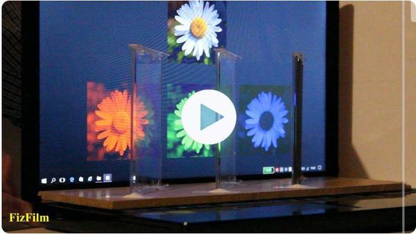
And the best example I found of the additive color mixing is this really cool
video.
NOTE: So having trouble connecting here so try this link if the above doesn't work.
It really makes the
point about how all the light makes white, which is pretty amazing when you think about it.
So back to our original question - why does this matter? Who cares? Well, the truth is that additive light mixing is how computers communicate color to our eyes. It also happens to be the way that the Sun communicates colors to our eyes.
The subtractive color mixing is the way we paint or try to copy those colors we see from the additive color mixing process
through color dying or printing onto paper. And so why that's important is that when we get into the problem areas of choosing colors for the best look, we will be sometimes translating colors from the additive color mixing process and trying to copy those with the subtractive color mixing process. We will literally be comparing apples to oranges, and we won't come out well.
It's almost as if the primary colors on the left become the secondary colors on the right, but then the yellow is one of the primary colors with turquoise and purple - things just don't really jibe from one color mixing set to the other. And that's exactly
what happens when you are translating those additive color mixing from your phone or computer to the subtractive color mixing of your fabric.
That's more a warning than anything else, because when you get into the danger Zone with the colors can really be difficult. For me, even as good as I am with color, I stay away from that transition zone. If I'm not sure that it's a good greeny-blue, then I stay away from it (I look best in warm colors). And I was absolutely
shocked when I had my cataract surgery and one eye had a "blue" lens put in to make things look more "clear." I accused the doctor of messing with the colors I see. He remarked that, no, my cataracts are yellow, and I've been seeing everything, particularly my reds, skewed to the warm side of the color wheel. After that, I had to give away a bunch of my cool reds. Reds are hard, but I've always believed that greens to blue are harder.
But it's particularly
hard if you don't even know about this. Now that you know, you can start watching for it, and make sure that you're on the right side of the color wheel.
Finally this week, a fun surprise here locally.
This looks like a really great gathering for a fun get-together where folks wear what they made. Read more about this @okcfrocktails
on Instagram or about the event here. You might even think about making something a little special for the event, but it won't be formal, just fun.
And please no warmups!!!!
The SewingArtistry Resource Library is designed to contain information to not only make your sewing better, but to aid in you fitting and flattering your shape, size and style. Check it out.
Look for future classes coming in 2024
The Core Pattern Shirt, (one of my favorites for woven core pattern that you can make into a myriad of different
garments),
Basic Knit Top (core pattern class for knit basic tops, shells, tees, dresses, and tunics)
|
Tracking a fashion trend isn't all that hard after seeing a few of them.
Living from Mid-Century Modern through Twiggy...
It's worth the time to look at these styles, particularly today as
there is a group of that wants to look....
This is the way fashion used to be -- pretty, flattering and I can't wait to make some of...
To view in browser along with past emails, click here. We respect your email privacy. |
|
|