The Fabric Has ArrivedMay 24, 2024 In our last episode, we left off with Claire going down the dark hole of fabricdom and getting hooked, well, more than hooked, on one fabric. And actually this has been something
I've been dreaming about for a long time.
Hint: When you go to a fabric store in a big city or you see something online, and it keeps speaking to you: you know like, "Why did you leave behind? You know I'm perfect for you. You know I will get your juices flowing like crazy," yeah well, go back and get the damn stuff. It's only fabric and it won't mold!
And that's exactly what I did. But right off the bat we have some problems.
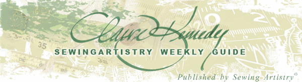
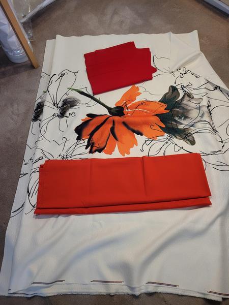
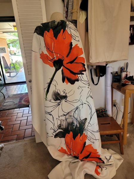
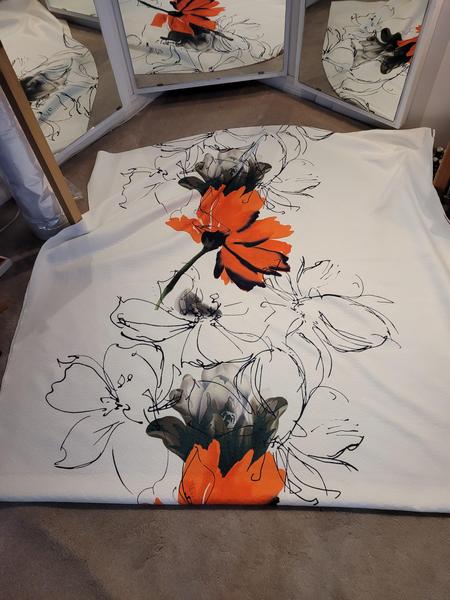
The description of "A large orange-red flower that fades to nearly pure orange at the tips of the petals," is really very much orange that goes to pure orange.
That bottom piece is about as orange as you can get and still be red. It's definitely red, but it tones more red with the flower.
Color online is a mess.
This looks almost crimson in the middle, but it's not - it's a very deep orange-red. This is the photo off their website.
That's OK because orange, along with orange-red, is my color range, so I knew that even if this showed up orange, I would be
able to work with it. But I will say that the longer I had this on the floor and looking at these two reds, that bottom red did really grow on
me, so I'll make the pants out of that red.
So I'm working with my elements - Color - to make sure I have a good tone with the whole outfit - the pants and the print. And I've decided on the lower fabric for the pants. I already have pants cut out of more red--red, which is fine cause I have
enough of that color in my wardrobe to go with things already made. And this is one of the many idiosyncrasies I can afford as a sewist. I can have various shades of red and orange in my closet because I don't have to depend upon finding them already made. This is also how the wealthy dress - they don't have to depend on what's in the stores. It's the luxurious life we lead as sewists!!!! So the other is the pattern—or patterns! I ordered enough to make a wonderful long shirt and a jacket. This brings up the other really important variable in buying online: the weight and
drape of the fabric.
The fabric turned out to be somewhere between drapey and stable enough to be a light summertime jacket. With black pants, it might be fun for a holiday, but probably not.
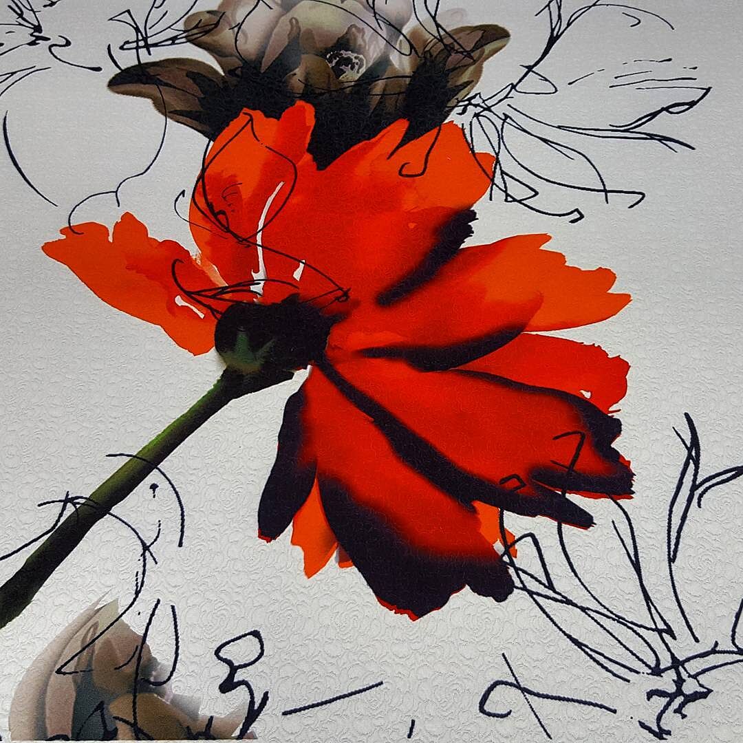
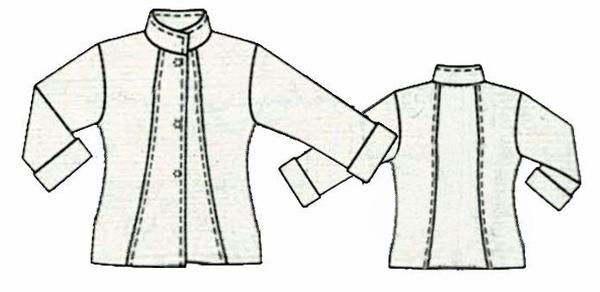
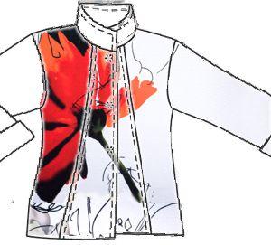
This jacket is a complete redo of an old Burda pattern that had a LOT of issues. One was that it was boxy, but then I liked that collar and lot and thought it would be worth messing with to make it right.
It's off the shoulder which I don't normally do, but I tapered and shaped that waist to give it a great silhouette so that even though it's off the shoulder, it still has a great line.
The thing that makes off the shoulder look hinky is when there
is a lot of bulk at the underarm, and around the bust area.
You can tell from these that these are tapered nicely under the arm and along the side. So even though there is a little bulk under the arm, it's not significant enough to be unattractive. This is a delicate balance but I've done this jacket in about
5 different fabrics, and it has always turned out well. Part of the reason is that I've tapered in those seams.
By tapering in the waist seams, I've created a silhouette that is not only attractive but also doesn't have the traditional bulk under the arm. One key reason I was able to do this is that the pattern had those neck-to-hem seams. This is like a princess seam, and it allows for a lot of fitting that you wouldn't normally have the opportunity to do with a side dart or waist-to-bust dart. I was
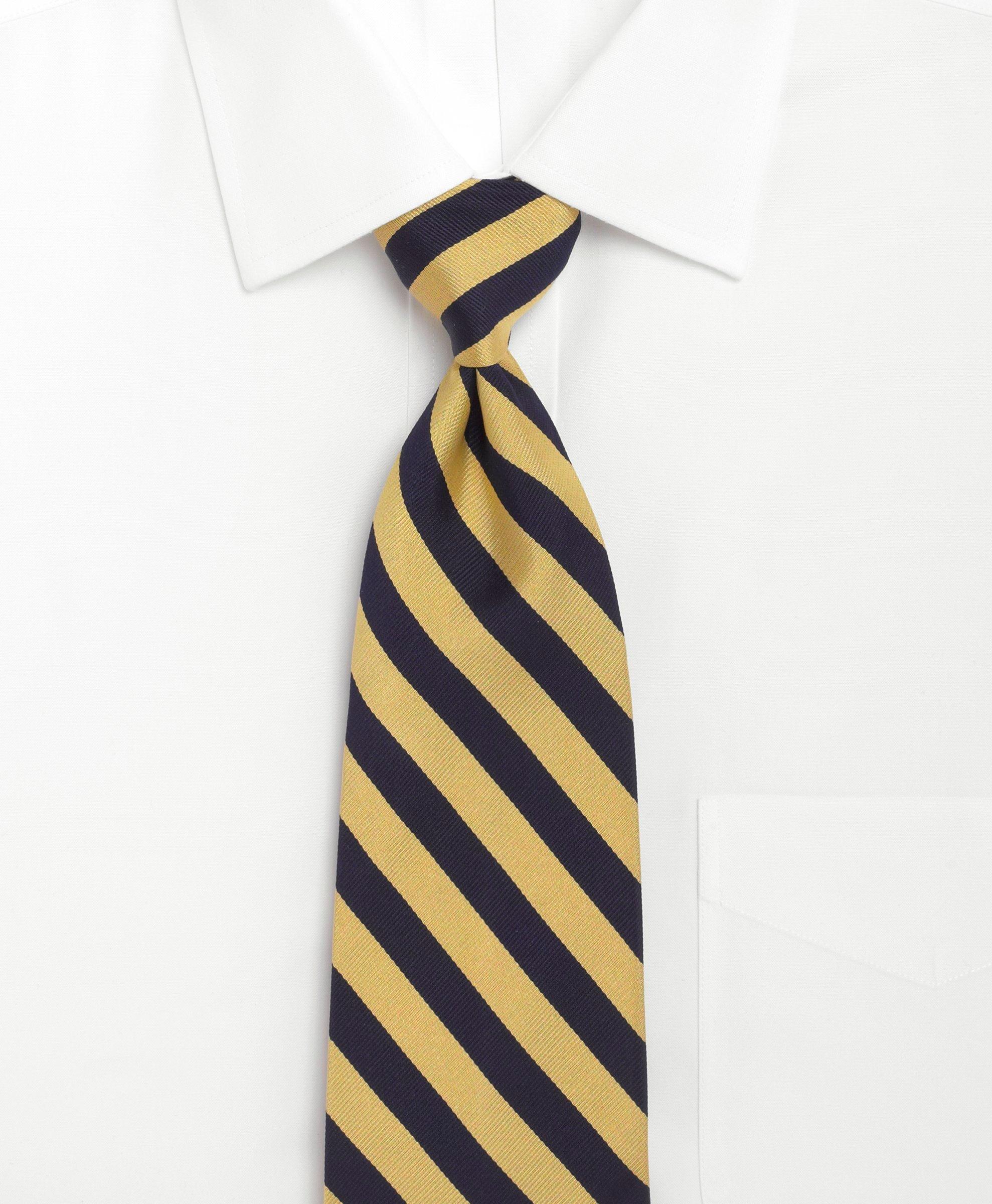
also able to move that front top-to-hem seam over the bust line to get a better fit there and then insert a pocket at the bottom so I have a hand pocket in the jacket. So now what's left is the placement of the flower. The first thing is that I like to make a more upper right to lower left flow. This is the traditional line of a formal military dress.
For formal wear, the riband or sash is worn "dexter" or from the right shoulder to the left hip. Why? Normally a sword was attached at the bottom,and formal dress wear, this is called dexter (which is Latin for right).
This is even used in describing the direction of men's ties - from upper right to lower left is dexter, while from upper left to lower right is called sinister (Latin for left), and that tells you a lot about how Latin developed one meaning for one side and
another for the other side.
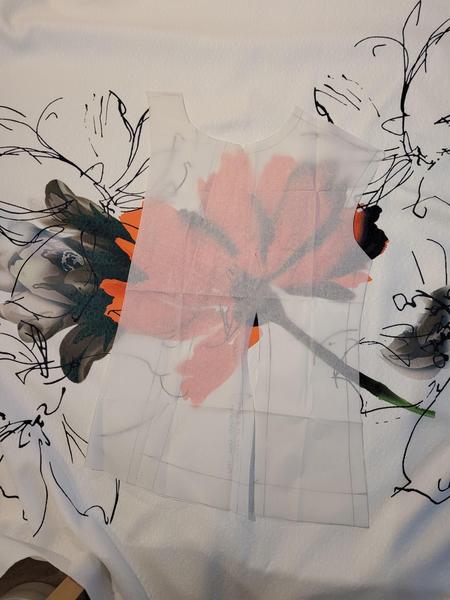
So I'm going more dexter with this pattern mostly because it's traditionally how the
eye travels across and looks more normal. But the flower cut on the grain, comes across sinister striped. And I'm not really interested in matching. This is draped on the grain on my mannequin.
The version on the Mood Fabrics site for idea is this.
So before I go too much further, let's take this apart - we have color, space and line as our elements. We have good balance - not 50/50; Rhythm - moving from the bottom up (not my favorite cause I like to focus on the face, but there is a nice pop on the
collar); Proportion - the big flower and lines and light space - actually the fabric solves this for us, so no problem there. These are the three principles I'll be working with. And in all categories, this blouse above, meets the mark - good use of balance/space and line/movement is good.
So here's my mockup and I'm moving dexter like I want, and I've got good balance and movement and line. The flower isn't too big, but it's obviously the key part, and it doesn't monopolize the whole design. The lines are nice and add more movement in a very
unobtrusive way.
But I noticed that the design in the fabric is with the flower running dexter.
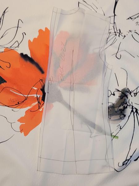
I also have to be careful that I'm on the grain - either lengthwise (which is preferred) or widthwise. But definitely not on the bias. This is a structured pattern, and it will never hang correctly even if I back the living daylights out of it -
it will always be droopy and falling poorly in certain areas, which is why we always cut on the grain, to prevent that from happening. Cutting on the lengthwise grain will give me this mockup.
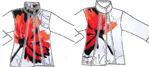
Yeah - it's not quite as artistic as this.
Is it? What's going on here? Why does one look better than the other?
|
So this one goes sinister, but that's not what bothers me the most about this design - it's too demanding. It looks like the flower is the main thing, and that's it. It's all about the flower, and no other lines or any of the other charm of the fabric
shows through. The flower takes all the attention. This is cut on the straight, and you will notice on the shirt example the flower is turned upside down, and that makes this cut "on the lengthwise" grain look right.
|
This one is cut on the widthwise grain. It's not as desirable as the lengthwise grain (that's a whole other subject for another newsletter). Just for now, take my word for it. BUT widthwise is sometimes acceptable depending on the designs.
Often this occurs when you have a dynamic but not symmetrical stripe - usually one of those artistic striped fabrics - like this artistically arranged fabric. I still like this view the best. This view is just much more artistic. |
So we're good in front - and here's how that lays out - the front right will be cut first so I can place the flower where I want it.
This is a fold over lapel - which will be nice cause I'll catch part of that red close to the face, and do the same on the other side, but it won't be mitchy-matchy. What about the back? (Oh, and I will be matching in front—I have enough fabric for that.) I want to keep the back simple—the front is enough of a challenge.
Here's the back. I will take the largest part at the bottom (hip) and the largest at the top (neck, shoulder area) draw a straight line, and then take in a "dart" instead of a cut-back seam. This will preserve as much of the flower design as possible and make the
flower look as balanced as possible (but remember, not centered or symmetrical—that's boring). Basically, the flower will be preserved with a few tucks which will be fine - a lot easier than trying to match the design.
Hopefully, this isn't too confusing, but more than that, I wanted to show you how, on a very complicated project, you can use the Elements and Principles of Design to work through a whole heap of problems - color, line, space with balance, contrast, and
proportion. And don't discount your own nature.
The one on the left looks wrong for a reason - it's too big - it dominates in an over-powering way. I mean I saw that instantly. This isn't that hard. But when it gets this confusing, use these Elements and Principles. They really do
work. So this is Plan A. Of course, I reserve the right to get inspiration and a whole new plan by the time I cut this out because inspiration
always runs amok in the middle of a project. That's the way she works!
The SewingArtistry Resource Library is designed to contain information to not only make your sewing better, but to aid in you fitting and flattering your shape, size and style. Check it out.
Look for future classes coming in 2024
The Core Pattern Shirt, (one of my favorites for woven core pattern that you can make into a myriad of different
garments),
Basic Knit Top (core pattern class for knit basic tops, shells, tees, dresses, and tunics)
|
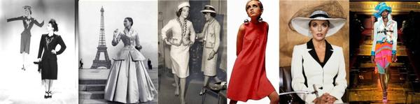
Tracking a fashion trend isn't all that hard after seeing a few of them.
Living from Mid-Century Modern through Twiggy...
It's worth the time to look at these styles, particularly today as
there is a group of that wants to look....
This is the way fashion used to be -- pretty, flattering and I can't wait to make some of...
To view in browser along with past emails, click here. We respect your email privacy. |
|
|