Principles of DesignMay 17, 2024 And so now the magic begins—well, OK, I said color was magic, and it is, but now things begin to make sense. Sometimes, I think art school should teach this first so that you know where
you're going. I guess I just never trusted the professor to get through elements to principles when they were droning on and on about Space and Size and Line and all those elemental things!
But now we get to combine all those elements with principles like pattern, contrast, emphasis, balance, proportion/scale, harmony, and movement. The principles and elements are often taught in art class to help construct a work of art, more traditionally on a canvas. But this works
in all other areas of art, music, interior design, poetry, writing, and clothing design. Maybe not all of them translate perfectly from one art form to another, but the idea and concept behind them do translate. If you don't have a good balance in your orchestra for your music, it doesn't work. If you don't have the proper movement in your interior design, things can look stagnant and boring. The same works for us.
Pattern - a regular arrangement of alternated or repeated elements (shapes, .ines, colors, or motifs)
One of my most fun things is using Esher designs, which are wonderful examples of patterns in design. The idea of printing the whiter/lighter on top of a fabric with the darker on the bottom for an outfit sounds dreamy to me. But this makes the point
in spades of how pattern becomes the dominant feature in this garment, and putting it together correctly totally makes the idea of using this for a garment idyllic. Basically, this works without any other feature - the more classic and basic the design, the better it looks. Contrast - The juxtaposition of different elements of design, for example, rough and smooth, shiny and dull, dark and light, to highlight their differences.
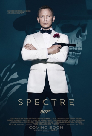
And here's that juxtaposition perfectly where I used the shiny side of the peau de soie to contrast the more "pearlized" side of the fabric to give us a great look - almost like the shiny lapels of a Bond jacket.
Emphasis - Special attention/importance
given to one part of a work of art (for example, a dark shape in a light composition. It can be achieved through placement, contrast, color, size, and repetition.
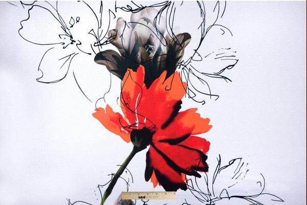
This fabric is over on Mood and I've been drooling over it for years, and finally popped the button and ordered it tonite. This long and I'm still in love with it tells me that I should have purchased it ages ago. But this is the epitome of Emphasis -
the huge large red flower and the black and white lines of the back with a ton of white screams emphasis. This is apparently as close as I can get to what this looks like straight out of the bolt, so when this comes I'll see what the rest of it looks like. It's a drapey fabric or that's the description so that means this will be a long summer white-blouse type garment, or I'm even thinking about backing it in a more substantial poly smooth, that would provide the structure for a
tailored jacket, with the smooth on the inside, but not lined - it would be backed and probably serged on the edges or bound. There's lots of problems to work out there, but all the more fun.
I'm working on this newer silhouette...
And would like to do a shorter, more structured jacket with a new pair of red pants!
But I digress. The big flower is all the cause of this! 🤔 Balance - A feeling of balance when the elements of design are arranged symmetrically or asymmetrically to create the impress of equality or weight or importance.
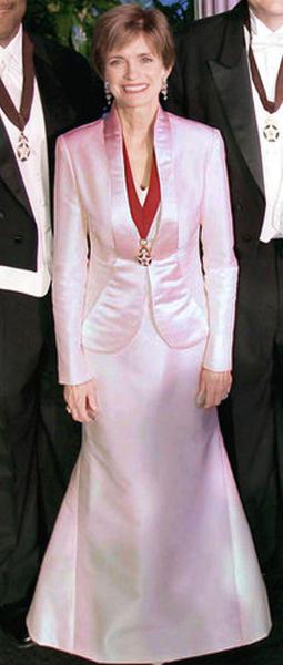
If there's anything that describes stealth wealth better it's balance. This is this basic, classic look that always in balance. The reason it looks right. It doesn't scream "LOOK AT ME!" And yet it looks right - there's nothing wrong with it.
One of the things that's interesting about an outfit when it's right, is that it simply "is." There's nothing to yank at your eyeballs screaming something's wrong. Sometimes, it's even hard to see the rightness of an outfit, and truly, the only way to check is with these elements and principles. Because if you know these elements and principles and how to use them, you can easily not only see it's right, but also see why it's right. And that last part is the
real secret to all this.
Balance more than any other principle is really hard to determine unless you know exactly what you're looking for. Proportion or Scale - The relationship between objects with respect to size, number including the relationship between the parts of a whole.
This is one of those things like color that you can get side-tracked on and if you're not sure what you're doing, it gets wrong. This gal is a perfect example. There's too much going on with the version on the left, and the body is totally covered,
and we have no idea if she has a waist or a breast or shoulders, or length or anything. But take those pants and let the proportional large part be the pant, then taper in the upper part, and the pant sings. Or take the oversized blouse with no shape, and add a slim skirt, and boom, it takes off.
And there are some tools that can help you with this, because it is tricky - I won't lie. Sometimes you look at yourself and think, something's wrong, but not sure what,
and the elements and principles can help but when you get to proportion, we all need more help and there are tools that can help with this.
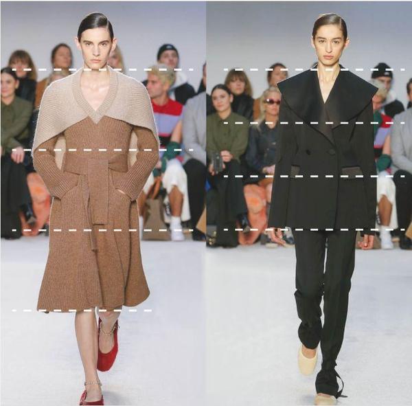
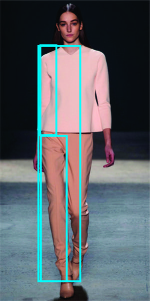
Here's one part in action where the rule of thirds is working to help with proportions. The waist, hem of the dress hit right on the rule of thirds, as does the jacket hem.
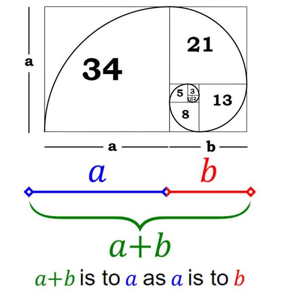
The other ratio that works is the golden ratio or divine
ratio.
This shows how the proportion works within that - it's based on the math formula of the ratio between the larger section to the total of the two. The formula below is much easier than the way I've explained it.
So now that you're confused between the golden ratio and the rule of thirds, how in the world will you make your way out of this? Well, I developed a handy little tool to help. Honestly, this looks so complicated, but it's really not. I also did
a video linked on the back page to show you how to work with the tool and how to help you with it. Here's the tool. But remember, this is to help you, not a dictatorial edict. This tool is meant to get you into a close area that will work for you - not an exact spot. I don't believe in exact spots, and I
don't believe in teaching them cause they bring about an unbelievable obsession with something that really doesn't need to be obsessed over. So remember this is to help and get you in the close zone where you hem length, jacket length and proportions work well for you.
The last part about proportions in fashion is the basic concepts, such as dark recedes and light projects. These help keep the proportions of your body in balance. Harmony - the arrangement of elements to give the viewer the feeling that all the parts of the piece form a coherent
whole.
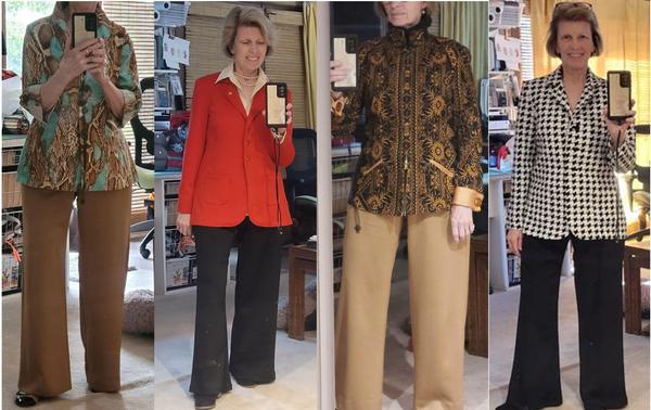
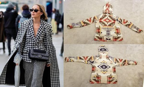
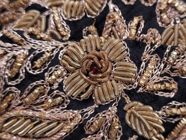
There are clearly disparate parts in both of these, but together, they make a hole and work well together. The Houndstooth extravaganza looks like it shouldn't work, but because of good harmony, balance, and even emphasis and the way the parts work
together, it works. On my Indian jacket, the pieces were clearly cut so that even when turned 90 degrees, the symmetry and relation to the rest of the design worked, even to the point that when zipped, it matched in front. Although these elements and principles sound horribly foreign and unrelatable, they work. I can't tell you how many times I was wrestling with a design for a client when, suddenly, plotting out through the elements and principles, I found the problem almost instantly, corrected it and wondered why I had such a hard time seeing it.
It took me a long time to come to terms with the fact that
although I had been denied entering into sewing or design school immediately out of college, and the alternative was art school, it did turn out for the best. I'm not sure I would have been as open to learning about the principles and elements of design otherwise. Only after I studied under my mentor for so many years did I begin to use these principles and elements, and it was amazing how easily design ideas came.
The SewingArtistry Resource Library is designed to contain information to not only make your sewing better, but to aid in you fitting and flattering your shape, size and style. Check it out.
Look for future classes coming in 2024
The Core Pattern Shirt, (one of my favorites for woven core pattern that you can make into a myriad of different
garments),
Basic Knit Top (core pattern class for knit basic tops, shells, tees, dresses, and tunics)
|
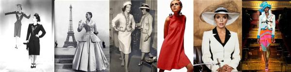
Tracking a fashion trend isn't all that hard after seeing a few of them.
Living from Mid-Century Modern through Twiggy...
It's worth the time to look at these styles, particularly today as
there is a group of that wants to look....
This is the way fashion used to be -- pretty, flattering and I can't wait to make some of...
To view in browser along with past emails, click here. We respect your email privacy. |
|
|