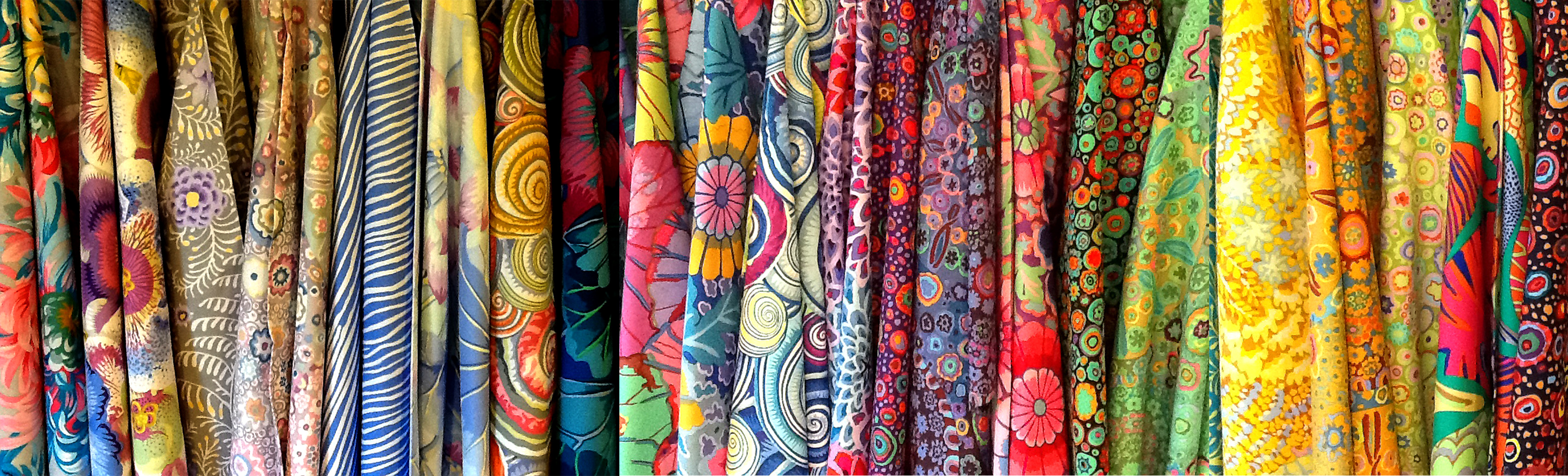
ColorMay 10, 2024 Color is something that always seems to jump out me more than anything else. Going into a a fabric store and seeing this...
just gets me so jazzed I can hardly think of anything else. So unlike all the other elements of design, color by far sang symphonies to me, and I fell in love instantly. So while the other elements were just ho-hum, color was all I needed to make
everything OK. The problem is that I got so side-tracked and emotional about it, I couldn't make head nor hair of it, and had to take a deep breathe and start all over again.
I nearly went berserk over this Mercedes ad from years ago. Man, who wouldn't want to wallow around on that right side?!
Once again, the elements came to my rescue and helped me maintain some semblance of sanity amid all that color.
I
know I've done this before, but there are some excellent charts that help describe color and qualify it so that it much easier to understand.
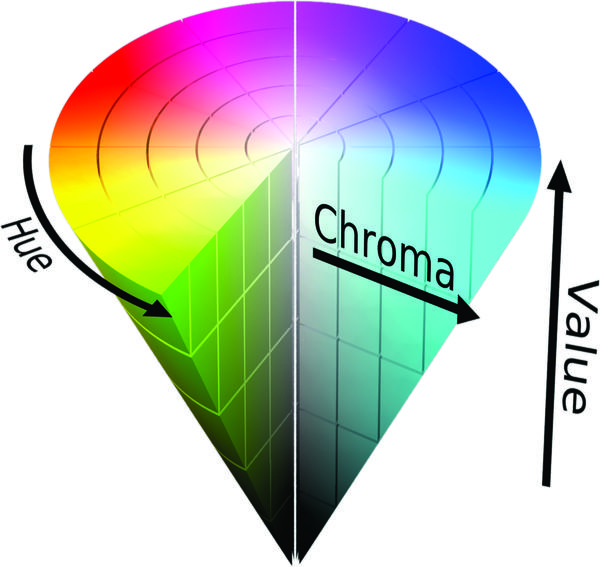
This is the first one which describes the three characteristics of color
Hue, Chroma and Value. Chroma is interchangeable with Saturation.
Hue is the color - red, yellow, orange, that sort of thing>
Chroma/Saturation - the intensity or lack of intensity pink to red. Red obviously has more chroma.
Value
is the dullness or darkness so red to maroon.
So with these three descriptors, you can pretty much get to any color in the spectrum or on the color wheel.
And speaking of the color wheel what is that anyway?
Isn't this just glorious?! This is the mix of colors from the very highest wavelength (Infra-red) to the lowest (ultraviolet), which miraculously match at the ends of the spectrum. The fascinating thing is that putting this into a circle makes color
combinations helpful. Complementary, monochromatic, analogous, triad, and split complementary are the best known, and of course complementary is the most famous. It builds on one of our other principles: Contrast. I'm doing the Principles after the elements, but with color, you can hardly go wrong with the complementary or contrasting color. Look at this page, white with black lettering, probably the easiest way to read written words.
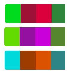
Complementary palettes are easy and very effective:
Here's some favorites - red and green for Christmas is as traditional as Turkey Dinner. The middle on may look familiar, this is the palette I based SewingArtistry on. A lont of variations, but the pop of the green and violet make a nice complement.
The third is clearly a Santa Fe-esque look with the blue sky and the adobe terracotta.
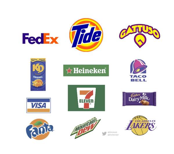
As a matter of fact it's so easy so many logos are based on complementary color schemes.
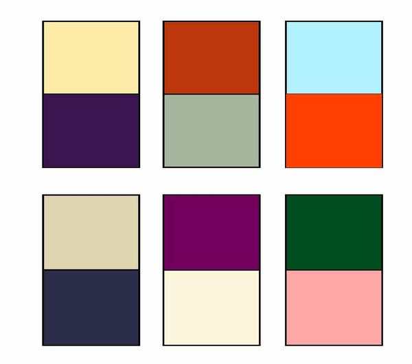
You can see all the usual suspects here - red/green, purple/yellow, and blue/orange. Advertisers and logo creators love complementary colors. They're easy and work. You can even do a little tweak on that by putting a hue with deep chroma, with a opposite hue with little value or vice versa and you can end up with some combinations like these.
These turn a little more sophisticated and a lot more interesting. One pops and the other "complements." It's a easy thing to do. The colors don't have to be full tilt Chroma and full value to work, although those do work, I just think that
shading down (less value) a red with a very hot chroma up green, can be really interesting. There's something else to consider here, too,
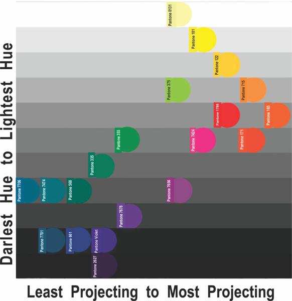
especially for those of us who like to play magical tricks with our clothes. Certain colors project more than others. The color that projects the most is yellow and the color that projects the least is purple/violet on the opposite side of the color wheel. That chart looks like this:
For me this is one of the most important charts out there. You can click on any of these images if you want to save them, but this is one of my favorites. I've labeled each color with the Pantone Chart number, which is invaluable in identifying color, and truly the standard for so many artistic industries. The charts are expensive and I replace them about once every 5 to 7 years. But they color is true. For example, the Pantone Red 032U is the same Pantone Red 032U color from past guides. They do add new ones, but the older colors are true, year
after year, unless they are faded, which is why I keep mine in a shaded place closed.
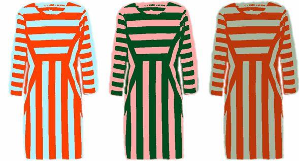
The projection and recession of the colors above are interesting because when you want to do that famous color blocking and not with black and white, you need to know how to project and recede colors, and that's why I love this chart so much. We all know that purple is darker than yellow, but what about turquoise and orange, or pink and violet and chartreuse? I always thought that
green was always receding, but not always!
And voila - receding and projecting colors do work - who would ever dream that a green would be projecting and an orange would be receding, but it works when you know the rules.
Finally one last thing to know about color, and where this really
matters is when you're buying online. There is a difference between the pictures we take with our phone, and the pictures we see on our screen. One is reflected light and the other is light emitting. The computer screen is made of lots of light emitting diodes. While the picture we take with our camera is reflected light.
Here's the color wheel that is reflected or subtractive.
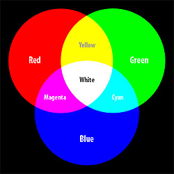
While this is the additive or light-emitting color wheel
You can see the difference in the color. Some of the colors in the additive color wheel don't even look the same. You can also tell which one is the one used for printers - the top or subtractive one - so that your cyan, yellow, magenta, and black are
your CYMK (K is the technical delineation for black). The additive, when all is combined, makes white, while the subtractive, all combined, makes black.
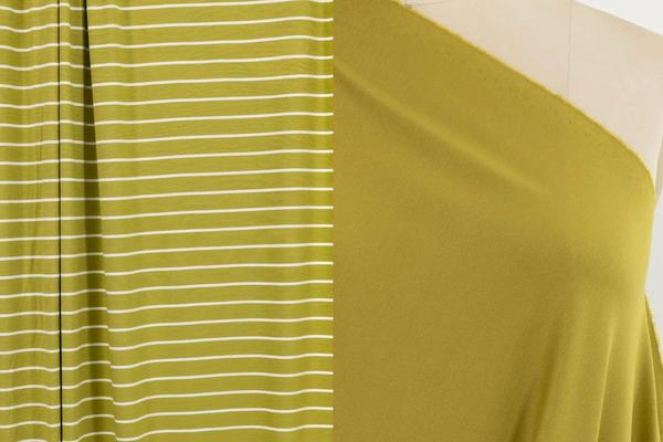
This is important because when you look at colors on your computer screen to see what fabric you want to purchase, it is absolutely impossible to tell what the true color is. This will give you heads up about ordering online. Here's another great example.
I have this fabric on the left, and would love to make something that these might tone together. In this shot, on my computer screen, it looks a little darker, but does it have more blue in it or more yellow? Does it have a little black in it to make
it darker or is it simply a deeper color with more chroma? Suddenly, I'm lost. Both of these come from the fine shop of Marcy Tilton and she does the best she can in with matching colors, but the truth is that if I ordered both of these fabrics, they might be the same color and they might not. It's impossible to tell because the photograph was taken in reflective or subtractive light, while the picture on the screen was in additive light.
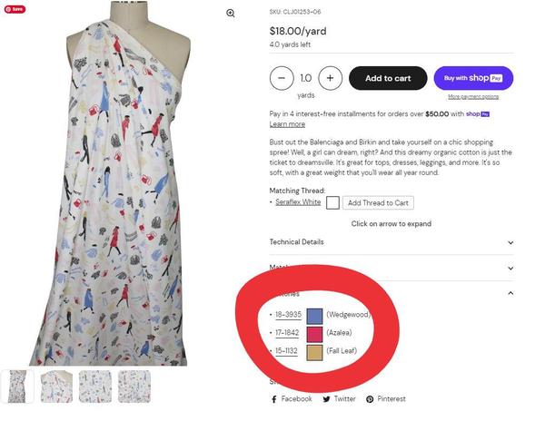
Now, there is help
because a few stores make efforts to solve this. Anne over on GorgeousFabrics.com really does make a huge effort to help you.
Remember me talking about that Pantone chart? Well, even with that simple chart, you can use the Pantone Connect site to change from one
chart to another. This is about as efficient as you can get. Another site that does the same thing is Linda at EmmaOneSock.com
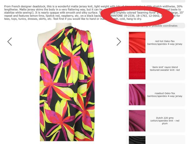
Here again, you can see the Pantone colors that you can convert with Pantone Connect and determine if that red is a crimson or a tomato red for sure. Both of these gals do a great job in trying to make purchasing fabrics as specific and informative as
possible. There is one other alternative that I like, and that is a subscription to the Vogue Fabrics Store annual catalog, where they send out samples of the fabrics. This is probably the best no-fail system. Not only do you get to check the color, but the weight and texture of the fabric. There have been fabrics I have purchased here strictly for
their color, and I have been very pleased that it was just what I was looking for. Right now I'm looking for a certain shade of jade that will match a very cool leather print jacket. Probably my best bet will be at Vogue Fabrics. Gorgeous Fabrics and Emma One Sock are excellent at shipping samples, and I have to do this for my clients; then, I can tell my client what she will be getting.
This is a lot to digest, but color is so vital. I've hardly gotten into
complexion and how important color is for your skin tone and it's not that hard. I did a newsletter a couple of weeks ago, and go check that out, cause there's a very cool video of how the additive color process works, better than I can explain it, and there's a great section on
skin tone.
It's almost like color deserves it's very category not in Elements or Principles of Design, but it is an element. It's just I love it so much!
The SewingArtistry Resource Library is designed to contain information to not only make your sewing better, but to aid in you fitting and flattering your shape, size and style. Check it out.
Look for future classes coming in 2024
The Core Pattern Shirt, (one of my favorites for woven core pattern that you can make into a myriad of different
garments),
Basic Knit Top (core pattern class for knit basic tops, shells, tees, dresses, and tunics)
|
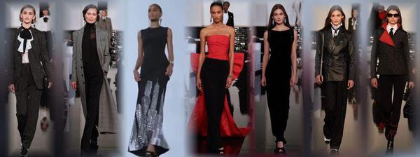
Tracking a fashion trend isn't all that hard after seeing a few of them.
Living from Mid-Century Modern through Twiggy...
It's worth the time to look at these styles, particularly today as
there is a group of that wants to look....
This is the way fashion used to be -- pretty, flattering and I can't wait to make some of...
To view in browser along with past emails, click here. We respect your email privacy. |
|
|