|
To View in your browser, click here
November 25, 2022
It's Thanksgiving weekend in the US and no better time than to thank all of you for your following me. For me to be able to return what I've learned may sound really cheesy, but I love doing this. To be able to leave videos and instructions that can help others experience the Joy of Sewing means that I can not only share my passion, but hopefully enthuse and infuse others with this passion that can bring so much enjoyment and fulfillment to your lives.
Here's what's coming:
I love using tailoring techniques in places that you wouldn't think of using tailoring techniques. Most of the time when you think of a tailored jacket that includes pad-stitching the collar and lapel, using horse hair canvas for interfacing, trimming away the interfacing and literally hand-stitching the interfacing into the garment so that it lays beautifully on the shoulders (yes, you know me and shoulders - they have to be supported and yet smooth). And then to finish
the jacket off with super-tailoring techniques that would make a Savile Row tailor cry!
 The thing is that these techniques can be used in a variety of places. Here's an example of that. This collar is a knit fabric - a fuzzy knit. Actually it was pretty cheesy looking, as a lot of fabrics can be, till you prepare them and match them up with something that really works. This is actually a
rust colored with a very high nap (meaning that it had a very definite one-way direction sort of like panne velvet which meant it had a very high shine). It was the perfect complement to this gorgeous wool/ cashmere loden green fabric. But I wanted a very structured collar that would wrap around and fold over, and a drapey cheesy knit wasn't going to do that. The thing is that these techniques can be used in a variety of places. Here's an example of that. This collar is a knit fabric - a fuzzy knit. Actually it was pretty cheesy looking, as a lot of fabrics can be, till you prepare them and match them up with something that really works. This is actually a
rust colored with a very high nap (meaning that it had a very definite one-way direction sort of like panne velvet which meant it had a very high shine). It was the perfect complement to this gorgeous wool/ cashmere loden green fabric. But I wanted a very structured collar that would wrap around and fold over, and a drapey cheesy knit wasn't going to do that.
So to take this apart a little more this is a contrast of colors (rust vs green) as well as textures (shiny panne vs dull brushed wool). When folks talk of complementary on the color wheel that's not the only opposites that you can create in your clothing. You can create opposites in texture (soft vs rough), opposites in light (shiny vs dull), opposites in shape (print that's soft and curvy vs print that spikey and sharp), opposites in space (dark big space vs small
light space) and size (dots that are very big vs dots that are very small). This is an excellent way to do opposites - so don't limit yourself to just color. OR as an added feature to your garment, using opposites in color and then an other element of design can make it that much more dynamic.
The whole idea of opposites is that there is nothing that shows white off better than black - nothing that shows shiny up better than dull - nothing that show up a big shape better than a little shape. The opposite always shows up the other really well. The big secret here is to keep the ratio from being boring. Boring is something like 50/50. When you have 50% red and 50% green, it's not very interesting.

Looking at both of these - which one do you think is more interesting. You'll choose one, but why? What's wrong with the other one. One is almost heavy with red while the other is accented with red. That makes it more interesting. The 50/50 split doesn't look like as much fun, while the 70/30 split looks more fun. Here's the analysis. Red projects
- it's going to come at you easier, harder, better than green which recedes. So making more green with red highlights, means that it's going to be more interesting to the eye (and brain) than a 50/50 split which is boring. Yep - the one on the left is more interesting.
This is the same way you want to do your contrasts and complements. Something a little off of 50/50 - more like 60/40 or 70/30, (but not 80/20 or 90/10 - they aren't balanced), will be more interesting and exciting.
But back to shaping our clothes the way we want. These tailoring techniques can add not only an incredibly personalized shaping to a garment, they can be a major problem solver. Once I found that rust knit - it was a done deal. I actually thought I might make a sweater to go under the coat, but it never happened. I think it was because the contrast was so excellent with the coat, that if I had made the sweater it would have been to mitchy-matchy - too contrived and
too coordinated. When that happens you lose the interest and the "pop" of the unusual.
For the ponte suit, I'm going to pad stitch the lapel, and collar which will shape the suit beautifully. Ponte (aka double knit and all stable knits) do not press crisply no matter how hard or hot you press them. So what you have to do is force the shape, and the best way to do that is with tailoring pad-stitching.
I'm also going to finish this jacket with a really in-your-face tailoring technique that the next time you see a suit on TV and you see this finishing technique, you're going to pop your eyes out, because it's one of those "when you're in the know" looks that you won't be able to forget.
Here's a short video showing you already the effect of the pad stitching. Remember this technique is not hard. It's simple stitching, but it's done a very distinct way to give that roll and curve of the fabric that we want. See what I mean!
Happy Thanksgiving!

The SewingArtistry Resource Library is designed to contain information to not only make your sewing better, but to aid you in fit and flattery of your shape, size and style. Check it out.
On the Blog
|
|
|
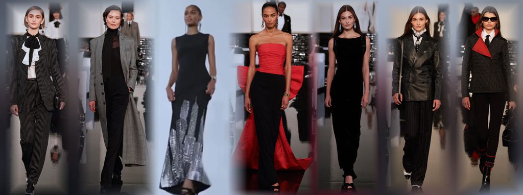
This is the way fashion used to be - pretty, flattering and I can't wait to make some of ...
|
|
|
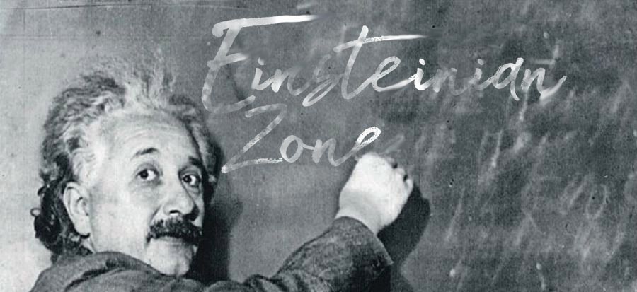
So no, you haven't dropped into another universe of the space-time continuum. This really is a sewing blog, but this... |
|
|
|
The other day I was doing the laundry and suddenly my machine wasn't spinning, thus wasn't washing. It was making...
|

To view in browser (so all images can be seen) or past emails or in your browser click here.
NOTE: Some email clients, software and web sites, do not allow pictures because they can contain nasty worms and viruses - ICK! So they will by default block you from seeing the pictures. This is a security measure from your email. I can't change that cause that means I would have to get inside your computer and mess with your security which you don't want! So you can do two things: 1.) you can disable your image blocker and that will
depend upon your software. You can Google it to see how to do that for your specific email. 2.) You can view it in your browser which is equipped to handle the nasties that might be in pictures. To do that you can click here to enjoy the full email with pictures!!
To talk about a sewing problem, a style quandary or size situation one on one with Claire, click here.
We respect your email privacy.
|
|
|
|