|
To View in your browser, click here
November 11, 2022
Sometimes I get these beautiful pieces from clients who have clothing from designers of decades ago. The styles have changed enough that they are beautiful pieces and are often so classic that they can be worn again and again. In fact, it is a very common practice among the generational wealthy - not the personal wealthy who are in the cash for a generation or two. This refers to the families who are able to pass on wealth from generation to generation.
It's done with concise steps toward advancing the wealth and conserving - not so much saving but conserving.
For example a person who has personal wealth with no idea how to save or keep it going on for many generations will spend differently than a person from generational wealthy. The personal wealth will spend on very hot, one-style items which means they only last for a short time, then they are incredibly dated. Here's an example of that:
 
Of course the one looks more mature, which is a sign of a classic style, but the other is that one looks that would last through a phase and is done and gone. The other thing that's obvious is that the dress on the right costs way more than the dress on the left. Here's a huge tip that generationally wealthy people know - buying the dress on the right for an initial higher out lay of cash, is actually cheaper
over the long haul because the dress on the right can be worn for many years, if not decades, which beats having to buy the dress on the left over and over and over no matter how cheap it is, it will cost more than the classic, enduring style on the right.
So it's always fun to get these pieces that are from wonderful designers from decades ago, that are so classic that they are still good today.
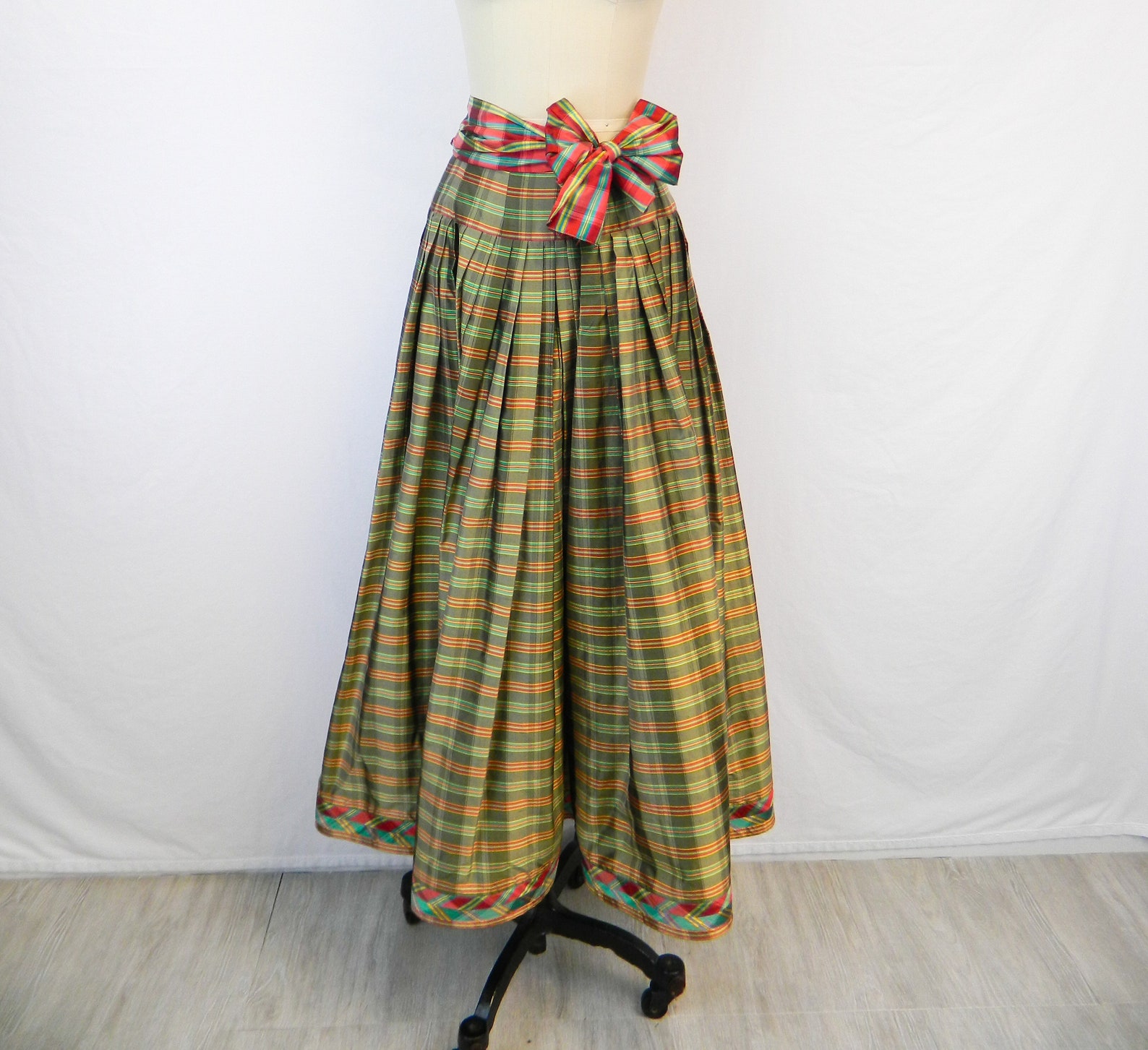 This piece is from Oscar de la Renta from about the mid 1980s and my client loved it back then. She's doing a Christmas party, and the red and green are lovely together. She wore it with a very light-weight, blouson sort of top which isn't so much
appropriate now, so she's ordered a sweater that we will cut off to match the hip piece so that it will fit perfectly around the dress. She had a bow with the skirt, but can't find it now, and that really doesn't matter, but a light-colored top with a red taffeta bow, would be gorgeous here - if we can get the right silk. This is a shiny taffeta silk that can be a lot of colors, however it's not always available. This piece is from Oscar de la Renta from about the mid 1980s and my client loved it back then. She's doing a Christmas party, and the red and green are lovely together. She wore it with a very light-weight, blouson sort of top which isn't so much
appropriate now, so she's ordered a sweater that we will cut off to match the hip piece so that it will fit perfectly around the dress. She had a bow with the skirt, but can't find it now, and that really doesn't matter, but a light-colored top with a red taffeta bow, would be gorgeous here - if we can get the right silk. This is a shiny taffeta silk that can be a lot of colors, however it's not always available.
Let's take a look at some of the details.

The detail that really shines out is the hem in contrasting color to the olive/orange red plaid of the skirt. It's not what you would think. The crimson, turquoise, is anything that you would think of putting with the olive/orange-red of the skirt, but it works in a very happy, gay sort of way. If I were to do a bow with this, I would use those two accent colors with one on one side and the other on the other side

The peplum is simply sublime. You don't really notice it till you think about it. This is a "stripe" fabric, but look how it curves around the peplum. How does that happen with a straight striped plaid, but it's not turning, or is it.

It's actually got about 14 darts all the way around the peplum to make it look like it's curving. This actually isn't that hard for we sewists to do, but it's expensive as hell for a designer to do this. Considering what the skirt cost back then, it would cost about $21,000 today. And yeah, that sounds like a lot, but that peplum is one of the reasons for the huge cost. Those darts have to be re-drafted and graded for each size and it's not
something that you do easily. The graph for grading the sizes on that peplum alone would make a Euclidean geometrist go cross-eyed!
When I saw that on the peplum, I nearly croaked. I've done this before and it's a royal pain in the arse, but it's so incredibly effective that it's hard to pass up.
The pocket feels a little off. This is simply because the pocket is in the pleat in front which is nice, but the pleat is loose and not stitched down. I've stitched it down at the bottom of the pocket to keep it from expanding out so that when she puts her hand in there and rests it in her pocket, the pleat will remain intact.

The next detail that is really interesting is the way the hem is sewn on. It's actually two bias strips with an on-the-straight trim on the bottom of the hem. That's a ton of work, but this is the sort of workmanship that was common in the 80s. As if that weren't enough, on the inside is the original plaid as a backing.
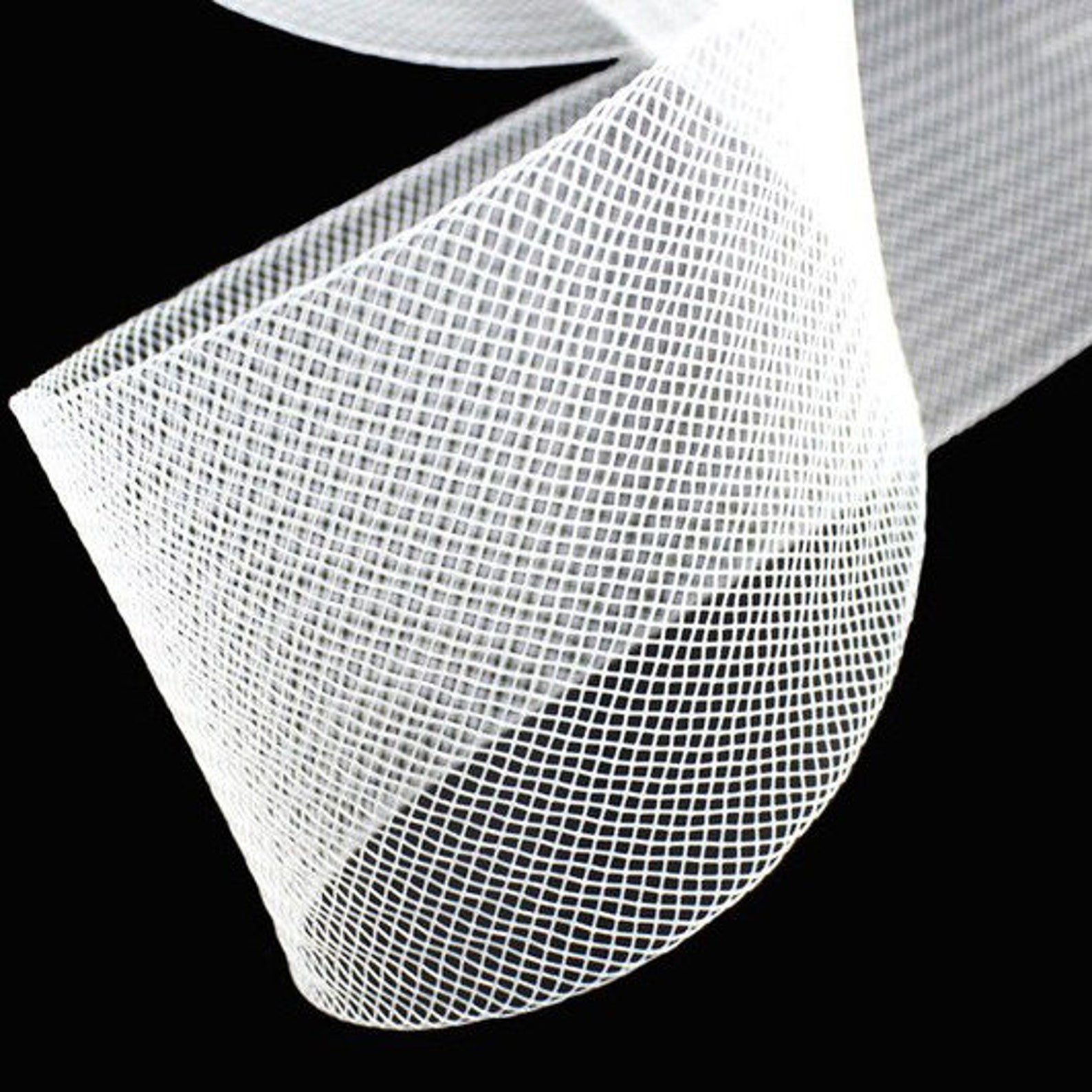 But that's not the end of the hem. It's backed by that stiff horse hair braid and it's pleated with the pleats in the skirt to help keep the skirt from flaring out all over everywhere. In the original skirt above, the hem is not pleated, but on my
client's skirt, the hem is pleated. We both like that better, as this keeps the skirt from looking like it's flying away with my client. Oscar probably did do this without pleating the horse hair braid, but we both like it hard pleated to keep with the look of the pleats and keep it from becoming so full. But that's not the end of the hem. It's backed by that stiff horse hair braid and it's pleated with the pleats in the skirt to help keep the skirt from flaring out all over everywhere. In the original skirt above, the hem is not pleated, but on my
client's skirt, the hem is pleated. We both like that better, as this keeps the skirt from looking like it's flying away with my client. Oscar probably did do this without pleating the horse hair braid, but we both like it hard pleated to keep with the look of the pleats and keep it from becoming so full.
Since we don't have an original photo of the original skirt on the runway, we're are left to our own devices about details of the skirt. The hem-pleating is one of those details. In this case, it updates the skirt without losing the original look at all.
I knew when this client brought me this piece it was going to be special - I just had no idea how special, till I got into it to sharing it with you all. It's fun to examine these pieces. But what's even more fun is to inspire and cause you to think about how you use fabrics and the ideas from designers in your clothing. Here are some interesting takes:
1. using diagonal and straight of the same print of a fabric for decoration or trimming or edging.
2. Using horse hair braid differently. This not only applies to horse hair braid, but also to other construction elements differently - interfacing, binding, diagonal interplay, all the while following standing couture practices like matching the stripe all the way around the skirt.
3. Using colors just a little off from the original combo of colors - this is the very tomato red/olive green combo with the turquoise/crimson combo and yet it works. It makes the garment look even more festive. The exciting, electric colors are as a "pop" of color - like an accent, while the more subdued combo of the tomato red/olive are the overall ground colors. Looking at these color combinations can cause you to
think in other ideas of color. Here's the original idea in the Adobe Color Wheel. Remember this is a "light" color wheel not an ink or dye color wheel, so the colors can seem a little different, but they are pretty good.
Let's take that color part and look closer...

We have the caveat here of color. We're dealing with coordination and one as the other: additive (light) and subtractive (print on fabrics or ink on paper) colors which are created differently. This always happens on computers. The color I see on my screen - light - (even between my two screens the colors differ) will be different than what we see printed on fabric (subtractive). However, I have put up the link for the
colors, and that link will take you to Adobe Color Wheel where you can reconstruct the color using your graphic software (Paint on PC and I'm not sure on iOS, but the Apple programs are very graphic friendly so I'm sure there is one that you can create your own color with RGB, CYMK or other pallets). This will give you about as close comparison as possible. Click on the graphics below to get more information.

This is the original color design. on the left are the basic ground colors and on the right are the "pop" accent colors. There is no white. I just wanted to put in a blank color there. This is based on the red/green colors which are opposites on the color wheel. So let's do some others.
This is based on the blue/orange opposites.

There's a lot of variations on the "D" color. I could have made that a lot lighter, but I was after a tan color. I wanted the orange opposite, but very dulled. Remember the two right colors are supposed to be background and not stand out much. Then the other turquoise and bright orange pop/accent stand out.
This is based on the yellow/purples opposites:

So here I really muted down the brassy yellow and the purples as the background, and even though I wasn't too far from the color wheel for the acid green, I found the pop of the crimson perfect, so I wasn't too much into a hot purpose. Again with the background on the left, and the pop/accent on the right and boom it works.
Some of these might really zing with you and some may not. But what does happen is that suddenly you're thinking about color wheels and opposites and accents and pops in a totally different way, all because of what a designer went through to figure out what was working in this plaid skirt and what wouldn't work.
You can do that with a few modern designers, but not all. The designer has to be a student and understand classic and not get too caught up in creating or forging a new look. That's why I like designers like Ralph Lauren, Jason Wu, Zac Posen and Alexander Wang. But older designers work from their heydey especially it its pertinent and works today - is the epitome of classic and can always be used as inspiration.
So let's not let the holidays get to far away with a Zoom for fun. I'll probably do more colors, cause it's fun to mess around with these colors to get a good idea about the order in the chaos. Colors are always something we can use especially around the holidays.
Scheduled for Wednesday November 16 @ 3pm CST, so check the calendar for you time - click it to add to your calendar.

If you have any questions LMK and we'll discuss them on the Zoom. If you would like to attend, just respond to this email in the title; Send Me The Zoom Link - and I'll send it on.
See you Wednesday!

The SewingArtistry Resource Library is designed to contain information to not only make your sewing better, but to aid you in fit and flattery of your shape, size and style. Check it out.
On the Blog
|
|
|
This is the way fashion used to be - pretty, flattering and I can't wait to make some of ...
|
|
|
So no, you haven't dropped into another universe of the space-time continuum. This really is a sewing blog, but this... |
|
|
|
The other day I was doing the laundry and suddenly my machine wasn't spinning, thus wasn't washing. It was making...
|

To view in browser (so all images can be seen) or past emails or in your browser click here.
NOTE: Some email clients, software and web sites, do not allow pictures because they can contain nasty worms and viruses - ICK! So they will by default block you from seeing the pictures. This is a security measure from your email. I can't change that cause that means I would have to get inside your computer and mess with your security which you don't want! So you can do two things: 1.) you can disable your image blocker and that will
depend upon your software. You can Google it to see how to do that for your specific email. 2.) You can view it in your browser which is equipped to handle the nasties that might be in pictures. To do that you can click here to enjoy the full email with pictures!!
To talk about a sewing problem, a style quandary or size situation one on one with Claire, click here.
We respect your email privacy.
|
|
|
|