|
April 29, 2022
One of the most fun things to do when you're thinking about variations is to combine prints or patterns in one garment. It may look like a simple hodgepodge of combinations, but there are actually some rules and guidelines to help you combine pieces really well.
This information all comes from the Elements and Principles of Design, which are wonderful guidelines when you get ready to start doing variations and the design looks too gloopy gloppy, or too hodgepodge-y or there's something wrong and you don't know what. These elements and principles help define what's right and why and often what's wrong and why.
Here's an example:

https://cdn.shopify.com/s/files/1/2031/8151/files/hexagon-scraps-iii.jpg?v=1600202773
This looks sort of jumbled and not real theme, simply a bunch of fabrics put together, but no thought about what the whole message is.
Here's where the elements and principles can help. The elements here are a collection of different prints. These are actually arranged in colors so that the yellows are close to the greens are close to the purples are close to the blues are close to the reds, but even that isn't in any sort of organized palette - like monochromatic, or complementary. The element of texture is pretty much the same. The size of the prints are all pretty much the same,
and the space each pattern covers is pretty much the same. So pretty soon here we can see that basically the problem is that everything is pretty much the same. There is no use of principles - no contrast, no emphasis, no balance, no proportion. It's literally as if someone made up the same fabric in different colors and called it a design. Put simply it's blah.

But look at this. We have two different patterns, but there is one that is dominant and one that isn't (it's the background).

Here's another example - the body is darker (receding) and the collar and sleeve are lighter (projecting). That means that the collar and sleeve are the two most important part. The collar (close to the face) demands your attention, but to keep it from becoming too boring, another part of the top is accented as well.

This is a really cool example from MarcyTilton.com using some of their fabrics.
First, notice how there is one piece that stands out - the large floral - this is the focus. There's also another piece that stands out because it's more condensed (the space element) - that's the dark background pieces. Then the other prints are small and fall into the background.
Notice too that the large pieces are probably 40% of the whole garment. A 40-60 proportion or 30-70 proportion are great proportions for contrast in texture, color, space or whatever element you're using.
Another thing to notice is that the smaller prints are almost like solids in that they can be used as backgrounds in a group of prints you're trying to put together.
Here's another idea.
 This is from Marcy Tilton. I picked out the light version (in the middle) and then called Marcy Tilton's Art Barn and one of the gals help me find some coordinating prints to go with it. So I kept the lighter bolder print as my main focus, and the
darker print as the "background" with one sleeve (furthest away from the white center) as a repeat of the white projecting piece and the darker part on the other sleeve and on the sides of the garment, and the third as the collar. This is from Marcy Tilton. I picked out the light version (in the middle) and then called Marcy Tilton's Art Barn and one of the gals help me find some coordinating prints to go with it. So I kept the lighter bolder print as my main focus, and the
darker print as the "background" with one sleeve (furthest away from the white center) as a repeat of the white projecting piece and the darker part on the other sleeve and on the sides of the garment, and the third as the collar.
The gals at the Art Barn at Marcy Tilton's are so quick to help you with suggestions for matching prints. What I really love using them for is matching colors, since I can't really tell online what is an olive green or a teal green, which for me is two totally different colors and one is great on me and the other isn't. I thought they did an excellent job of matching not only colors, but of matching the print so that one is dominant and one is in the
background.
There are other rules and guidelines that you can develop on your own by using the Elements and Principles of Design. And don't get all blurry-eyed on this.
Some of the Common Elements are:
(I'm using the ones that pertain to our sewing art!)
- Line
- Shape
- Form
- Color
- Texture
- Space
Think of these as the parts of the composition of the garment you're making.
Some of the Common Principles are:
(that we use in our sewing art)
Pattern (and not like Vogue, Butterick or paper pattern, but this refers to a design pattern)
- Contrast
- Emphasis
- Balance
- Proportion/Scale
- Harmony
- Rhythm/Movement
The principles are the guidelines that help you use the elements or parts in a garment design. You do NOT have to use every principle or element in every garment. As a matter of fact, that would be hugely busy and overwhelming. You
can use one or two Elements with one or two Principles to make your garment a sound design.
- So you could use color (element) in a contrasting (principle) way - like having a coral and turquoise ensemble.
- You could use texture (element) in a contrasting (principle) way - like having a shiny satin next to a dull velvet.
- You could use one design like a basic flower outline (shape) in a proportional (principle) way - like having a big basic flower then with lots of the same floral outline as a border.
This system will feel convoluted and awkward at first, but using it becomes second nature and pretty soon you're reading through design ideas quickly and seeing what works the best for you.
As an exercise, you can browse through some designs on Pinterest and pick out the ones you like, and then take them apart.
What element is the design using?
What principle is the design using?
Is it using more than one element?
Is it using more than one principle?
By taking it apart, this can give you a great idea about what makes up a good design, why it works, and even better why it doesn't work, which means you can use the former and avoid the later! All before you even start cutting a garment, you can discover if your work works or not.
Here are some Beginner Guidelines:
- Make one of your prints dominant and the other background
- Stay away from the 50/50 mitchy-matchy proportion. 60/40 to 75/25 are the good proportions to stay with. You don't want to get into the 90/10 either because that way one overpowers the 10% and becomes too bombastic of a garment.
  are in the background Another key part is to stay away from the 50/50 mitchy-matchy proportion. 60/40
to 75/25 are the good proportions to stay with. You don't want to get into the 90/10 either because that way one overpowers the 10% and becomes too bombastic of a garment. )
- Notice how many of these have an abstract, large sized or floral print and the coordinating pieces are dots or stripes - that's a great way to match different prints.
If you're puzzled over why something doesn't work, or simply wondering if your idea does work, using these elements and principles can really make a huge difference.
For more on the Elements and Principles of Design, I have a resource in the library that walks you through all the examples and possibilities. One is the basic Elements and Principles and the other includes a color primer because I consider color one of the most important of all elements.

This is a beginning guide on what to do with your core pattern after you have fitted and worked on it.
All the work that you have done in your core pattern contains all the information to make a garment that you will totally love. This means you really don't have to buy another pattern for making skirts, pants or leggings. Variations on your core pattern makes it possible for you to have the styles you see in a photo or on Pinterest without having to look for the pattern that looks like it might work. You can now simply trace it onto your core pattern and
you're done.
This resource also contains some other important resources at huge discount because they are so important to this creative process of varying your core pattern. It also contains some downloads that aren't available in the Resource Library at all, but are vital toward making good design.
In this world of crazy, illogical fashion, we sewists are having to turn into designers. That sounds really hard and foreboding, but it's not. Unlike designers, we simply haven't had all the experience they have, most of that experience they got when they went to design school. More than anything I wanted to make this process encouraging, empowering and enlightening without having to worry about whether or not you could vary your core pattern.
You can! It isn't that hard. It is knowing some guidelines and charging out into the unknown. That's what we sewists do and we do it very well most of the time.
This is the beginning of the series into variations on core patterns. I wanted to start with something basic, so that you wouldn't feel so intimidated. It takes a while to write these up, cause I'm an idea factory, and coordinating and organizing these ideas can be monumental with the sewing muse yacking in my ear 24/7.
The resource is available now at a discount so that you can enjoy it before spring starts in full force. Right now, I'm thinking happy, colorful and pretty. Those are all fresh looks for future clothes. When things seem upside down, it's great to have something to make us happy and often bright, springtime and summertime fabrics are just as much as drab, dark and somber fabrics. I'm ready to be beautiful, comfortable and look flattering in my clothes and
I'm dying to share that with you.
Skirts, Core Pattern Variations, Part 1 (but there's more than skirts in here)
On the Blog
I wrote this about 10 years ago but since then I've changed IT folks twice, changed hosting services, had my ...
|
This reminds me of the all-too-often-quoted add: Where's the beef? https://youtu.be/Ug75diEyiA0 So the funniest thing about this, is that she ...
|
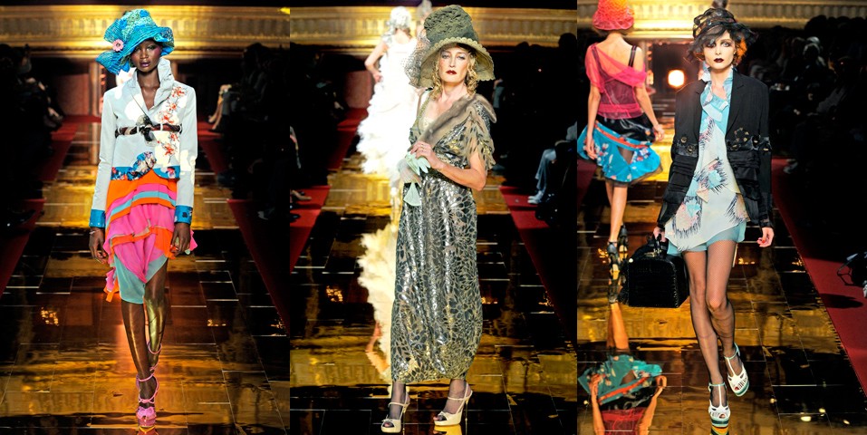
And yet another wonderful Spring/Summer 2022 couture show. For so many decades it's been so discouraging to watch season after ...
|
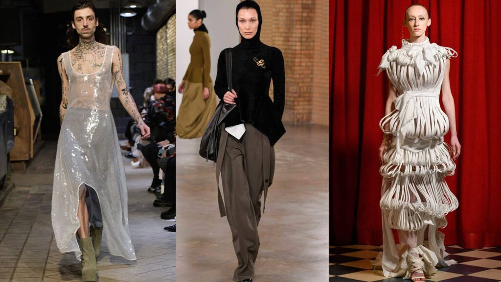
This popped up on my feed for some reason, and the first thing I saw was this: And thought - ...
|

To view in browser (so all images can be seen) or past emails or in your browser click here.
To talk about a sewing problem, a style quandary or size situation one on one with Claire, click here.
We respect your email privacy.
|
|
|
|